Sirv Zoom
About
Important: This documentation is for Sirv JS v2, which uses this script: https://scripts.sirv.com/sirv.js. We recommend using Sirv JS v3 instead. Go to the Sirv JS v3 zoom documentation.
Sirv Zoom lets you rapidly zoom into huge images. It works like Google Maps - click the image to zoom-in, one level at a time. You can also use the mousewheel or double-tap on a touch device.
Demo with single image
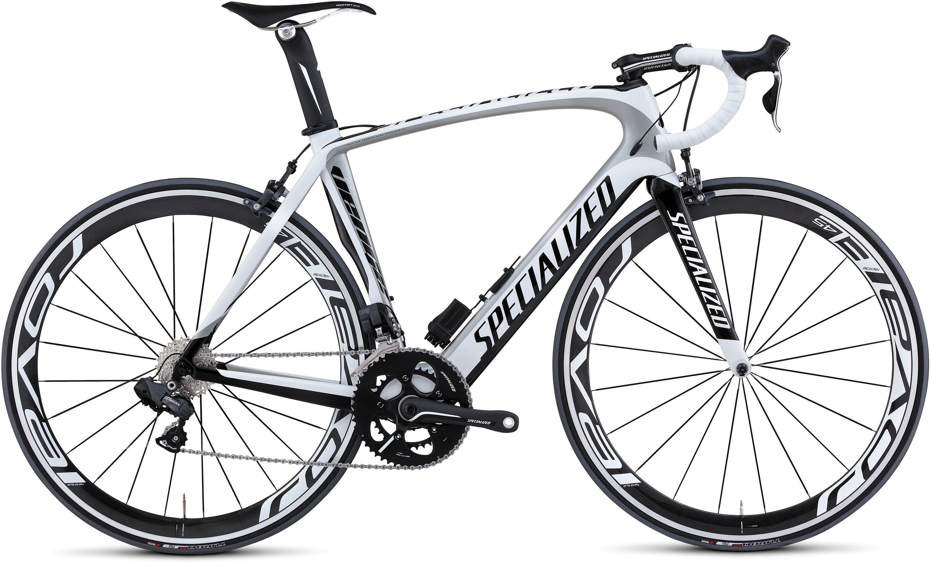
Sirv is able to zoom deep into images incredibly fast by slicing your image into thousands of small image tiles.
Images can be zoomed upon:
- Single-click / double-click
- Mousewheel
- Double-tap (on touchscreens)
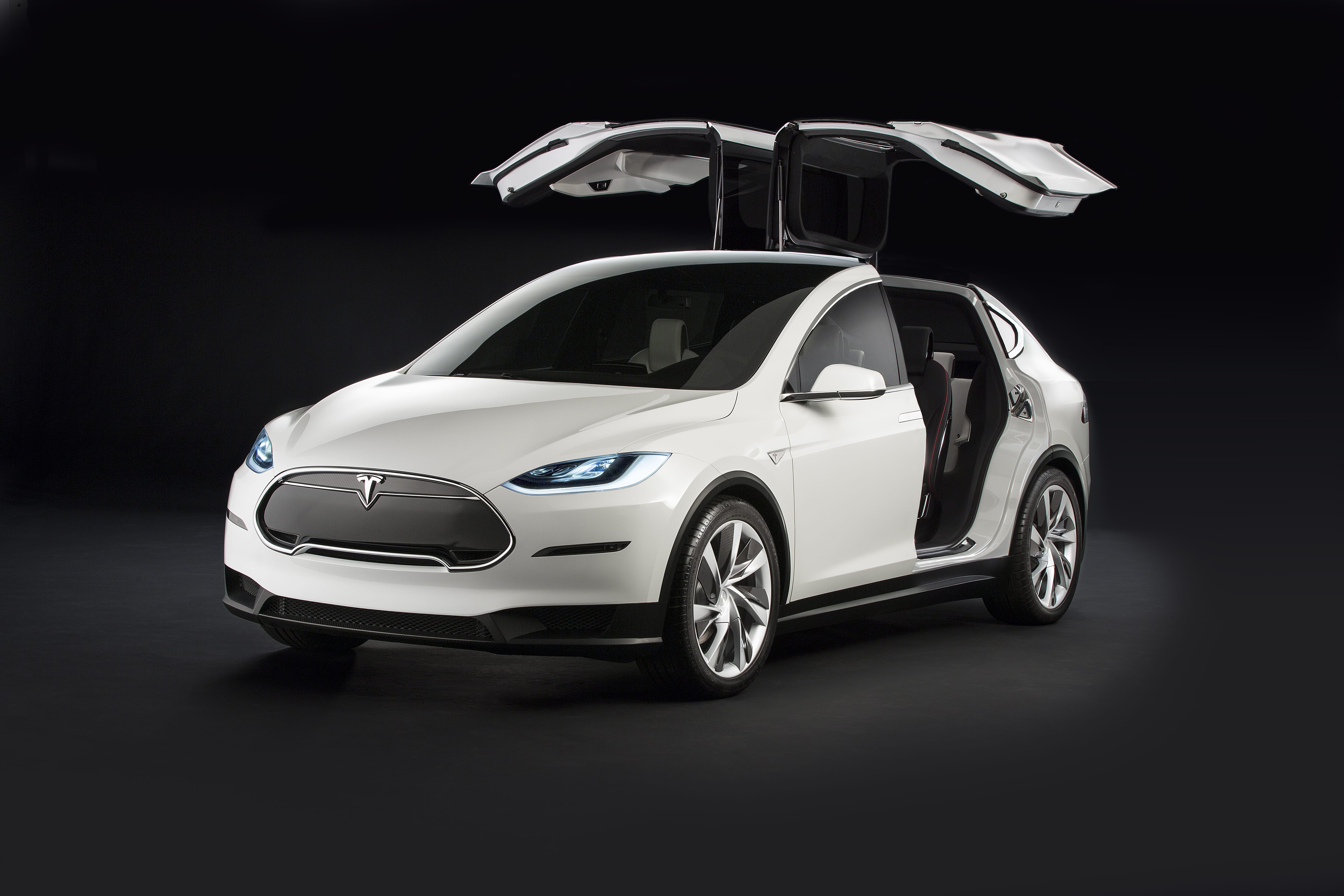
Demo with multiple images
Sirv Zoom can auto-generate thumbnails for all your images. This allows you to swap between lots of your pictures.
The example below has 3 zoomable images. Every thumbnail was created automatically from the original large image that was uploaded to Sirv.
How to create a Zoom
Any image that you upload to Sirv is instantly ready to be zoomed.
Go to an image in your Sirv account and click the "Sirv Zoom" option. It'll show you the embed code for your page.
1. Paste the code for the sirv.js file before the </head> of your web page (or elsewhere on your page):
<script src="https://scripts.sirv.com/sirv.js"></script>
Alternatively, use the 32% smaller sirv.nospin.js, for slightly faster loading (if you're not using Sirv Spin):
<script src="https://scripts.sirv.com/sirv.nospin.js"></script>
2. Paste the code for your zoom image wherever you want it to appear on your page, using the <div> embed code shown in your account. It looks like this:
<div class="Sirv" data-effect="zoom" data-src="https://demo.sirv.com/modelx-1.jpg"></div>
Alternatively, you can embed a zoom using <figure>, for example:
<figure class="Sirv" data-effect="zoom" data-src="https://demo.sirv.com/modelx-1.jpg"></figure>
Instead of using the data-src attribute to specify the image source, you can use <img> as a nested tag, for example:
<figure class="Sirv" data-effect="zoom">
  <img data-src="https://demo.sirv.com/modelx-1.jpg" />
</figure>
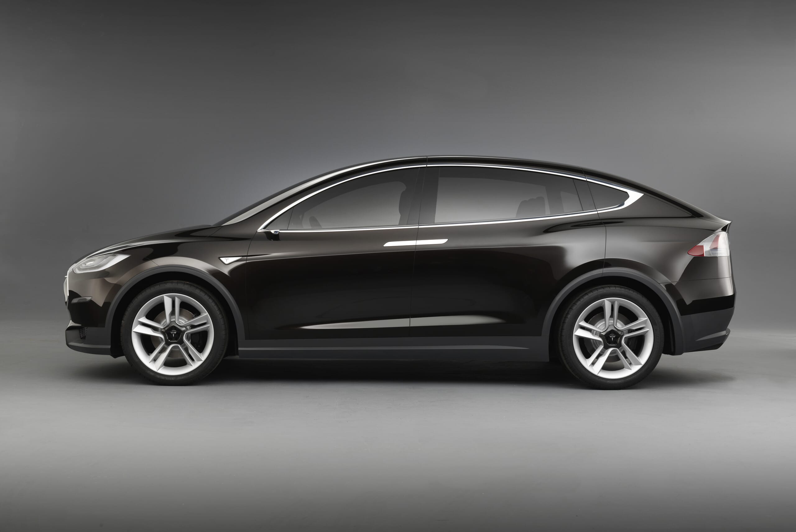
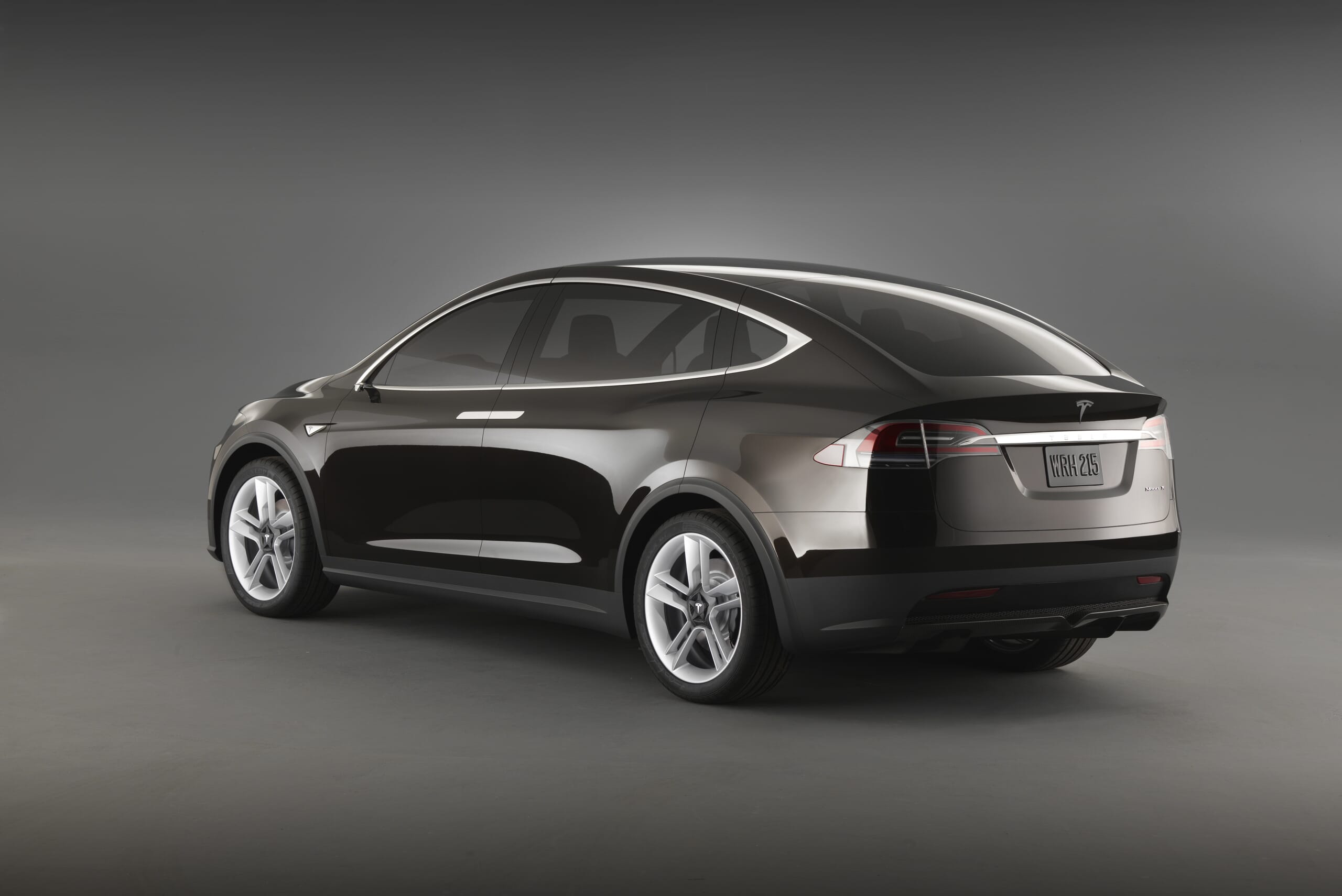
Multiple zoom images can be configured in nested <img> tags, like so:
<figure class="Sirv" data-effect="zoom">
  <img data-src="https://demo.sirv.com/modelx-1.jpg"/>
  <img data-src="https://demo.sirv.com/modelx-2.jpg"/>
  <img data-src="https://demo.sirv.com/modelx-3.jpg"/>
  <img data-src="https://demo.sirv.com/modelx-4.jpg"/>
</figure>
Alternatively, place the main image in a data-src attribute and additional images in nested <img> tags:
<figure class="Sirv" data-effect="zoom" data-src="https://demo.sirv.com/modelx-1.jpg" >
  <img data-src="https://demo.sirv.com/modelx-2.jpg"/>
  <img data-src="https://demo.sirv.com/modelx-3.jpg"/>
  <img data-src="https://demo.sirv.com/modelx-4.jpg"/>
</figure>
Options
Full list of zoom options
| Option | Default | Options | Description |
|---|---|---|---|
| zoom-on-wheel | true | true / false | Zoom In/Out on mouse wheel. |
| fullscreen | true | true / false | Enable or disable the fullscreen view. |
| fullscreen-only | false | true / false | Go immediately to fullscreen on click. |
| click-to-zoom | 1 | 0 / 1 / 2 | Number of clicks to zoom in (0 = disabled). |
| thumbnails | bottom | bottom / left / right / #id | Thumbnail position (use #id to put them elsewhere). |
| thumbnails-orientation | horizontal | horizontal / vertical | Thumbnail orientation, in case positioned elsewhere with #id. |
| squareThumbnails | true | true / false | Enable or disable square thumbnails. |
| contextmenu | true | true / false | Enable/disable context menu (right-click). |
| map | false | true / false | Enable/disable the navigation map. |
| mapSize | 1-100 | 25 | Size of the navigation map in percent. |
| textZoomIn | Zoom In | any text | Context menu text for zoom-in. |
| textZoomOut | Zoom Out | any text | Context menu text for zoom-out. |
| textEnterFullscreen | Enter Fullscreen | any text | Context menu text to enter fullscreen. |
| textExitFullscreen | Exit Fullscreen | any text | Context menu text to exit fullscreen. |
| textDownload | Download Image | any text | Context menu text to download the image. |
Ways to apply options
Options can be applied individually or globally.
In order to apply options individually to a specific zoom, place your options inside the data-options attribute. For example, this would disable the mousewheel and align the thumbnails right:
<div class="Sirv" data-effect="zoom" data-options="zoom-on-wheel:false; thumbnails:right"><img data-src="https://demo.sirv.com/test-bike.jpg" /></div>
To apply options globally to all your spins, place your options inside a script tag on your page, for example:
<script>
  var SirvOptions = {
    zoom: {
      zoom-on-wheel: false,
      thumbnails: "right"
    }
  };
</script>
Or use:
<script>
  var SirvOptions = {};
  SirvOptions.zoom = {
    zoom-on-wheel: false,
    thumbnails: "right"
  };
</script>
Mousewheel
To disable the mousewheel from zooming into the image, set the zoom-on-wheel option to false:
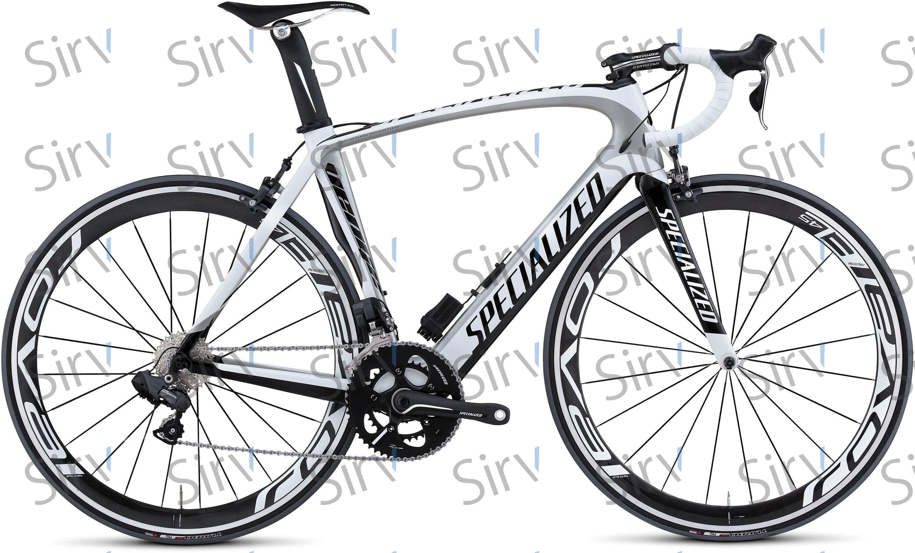
<div class="Sirv" data-effect="zoom" data-options="zoom-on-wheel:false"><img data-src="https://demo.sirv.com/test-bike.jpg" /></div>
Fullscreen
Images look even more impressive in fullscreen. In order to enter fullscreen, click the button  located in the top right corner of the zoom. See below on how to customize buttons.
Instant fullscreen
You may wish to make fullscreen the default user experience by setting the fullscreen parameter to true. When the user clicks anywhere on the image, fullscreen will open:
<div class="Sirv" data-options="fullscreen-only:true"><img data-src="https://demo.sirv.com/test-bike.jpg" /></div>
In the bottom right corner, a magnifier icon and "Enlarge" text is shown.
The location of the message can be changed by adding the following CSS to the page and changing the left/right/top/bottom properties as you wish:
<style>
  .sirv-zoom-figure-view.fullscreen-only .sirv-zoom-button-fullscreen > span:after {
    right: 12px;
    bottom: 12px;
    top: auto;
    left: auto;
  }
</style>
The magnifier and text can be removed by adding this CSS rule to your page like so:
<style>
  .sirv-zoom-figure-view.fullscreen-only .sirv-zoom-button-fullscreen > span {
    display: none !important;
  }
</style>
Fullscreen thumbnails
Thumbnails of other images are displayed to the center bottom in fullscreen. They automatically hide after 3 seconds.
To make thumbnails permanently show in fullscreen, add this code to the page CSS:
<style>
.sirv-zoom-figure.fullscreen-mode .sirv-zoom-thumbnails {
    -webkit-transform: translateY(0) !important;
    -moz-transform: translateY(0) !important;
    -ms-transform: translateY(0) !important;
    transform: translateY(0) !important;
}
.sirv-zoom-figure.fullscreen-mode .sirv-zoom-thumbnails .sirv-zoom-button-thumbs {
    display: none !important;
}
</style>
Navigation map
A small version of the image can be shown in the corner of the picture. The map marks the position of the total image that is currently in view. This makes it easier to navigate around very large images.
The map automatically appears when the user zooms in:
The map is off by default. In order to enable it, set the map parameter to true:
<div class="Sirv" data-options="map: true;"><img data-src="https://demo.sirv.com/test-bike.jpg" /></div>
The map size is defined as a percentage of the image and can be adjusted with the mapSize parameter. The default is 25%. This example increases it to 35%:
<div class="Sirv" data-options="map: true; mapSize: 35;"><img data-src="https://demo.sirv.com/test-bike.jpg" /></div>
The map is automatically disabled on smartphones because the small screen would make it too intricate to navigate.
Zoom levels
The number of clicks needed to zoom to the final level is determined by the difference in size between the small and the large image. Sirv automatically calculates a comfortable level of zoom: deep enough for much greater detail, shallow enough to prevent disorientation.
In order to add more zoom levels, either upload a larger image to your Sirv account or embed the image at a smaller size in your page.
For example, here's a 3000px width image embedded at 300px (click 3 times to final zoom):
This is a 3000px width image, embedded at 600px (click twice to final zoom):
Styling Sirv Zoom
Thumbnails
You can change the location of the thumbnails to left, right, bottom or somewhere completely different on your page. The default location is bottom, which places image thumbnails under the main image. To change it, set the thumbnails option to left like so:
<div class="Sirv" data-options="thumbnails:left"><img data-src="https://demo.sirv.com/test-bike.jpg" /></div>
You can also change the orientation for thumbnails to be vertical or horizontal by applying thumbnails-orientation:
<div class="Sirv" data-options="thumbnails:left thumbnails-orientation:horizontal"><img data-src="https://demo.sirv.com/test-bike.jpg" /></div>
In order to position the thumbnails elsewhere on your page, place them in a div wherever you like and give the div a unique ID. Identify that ID in the code with a leading # like so:
<div class="Sirv" data-options="thumbnails=#place-div-id-here"><img data-src="https://demo.sirv.com/test-bike.jpg" /></div>
The height of horizontal thumbnails or width of vertical thumbnails can be changed via CSS, for example:
<style>
  .sirv-zoom-thumbnails.thumbs-horizontal {
    height: 90px;
  }
  .sirv-zoom-thumbnails.thumbs-vertical {
    width: 90px;
  }
<style>
You CSS to adjust spacing, margin, padding, and borders. For example, a thumbnail border can be added like so:
<style>
  .sirv-zoom-thumbnails li {
    border: 1px solid black;
  }
</style>
The active thumbnail can be highlighted with CSS like so:
<style>
  .sirv-zoom-thumbnails li.sirv-thumb-selected {
    border: 1px dashed red;
  }
</style>
Background
Change the background color of the enlarged full-screen image by updating the .sirv-zoom-figure.fullscreen-mode class.
This CSS will make the fullscreen background and thumbnail background black:
<style>
  .sirv-zoom-figure.fullscreen-mode,
  .sirv-zoom-figure.fullscreen-mode .sirv-zoom-thumbnails {
    background: #000;
  }
</style>
Responsive width
You can set a responsive width of the image in %. This exampe shows a 100% width image to fit the available space in this column:
<div class="Sirv" data-effect="zoom" style="width:100%"><img data-src="https://demo.sirv.com/test-bike.jpg"></div>
Profiles
You can apply any of your Sirv profiles (a set of predefined settings) by using the data-profiles attribute in a zoom. In the example below, my-profile is the name of the profile being applied:
<div class="Sirv" data-effect="zoom" data-profiles="my-profile" data-src="https://demo.sirv.com/test-bike.jpg"></div>
You can also specify particular profiles for different screen-size devices. This is especially helpful for designing websites with different layouts for mobiles, tablets, and large desktop screens.
In order to do this, add each profile, comma separated. Specify the w suffix and the pixel width of the maximum screen width that each profile is intended for. The profile without a descriptor is the default profile. The example code below has 4 profiles, with the last being the default profile:
<div class="Sirv" data-effect="zoom" data-profiles="car-zoom-small 767w, car-zoom-medium 959w, car-zoom-large 1279w, car-zoom-xlarge"></div>
Buttons
Change the style of the buttons by using the .sirv-zoom-button CSS class. You can specify new dimensions, colors or even change the icons themselves.
Here's an example with smaller buttons:
That style was created by adding this CSS to the HTML page like so:
<style>
.sirv-zoom-button {
  width: 20px;
  height: 20px;
}
.sirv-zoom-nav-controls {
  width: 22px;
}
</style>
This example has larger, colored buttons with reduced opacity and a drop shadow:
The following CSS styles were applied:
<style>
.sirv-zoom-nav-controls .sirv-zoom-button {
  border: 1px solid rgba(0, 0, 0, .5);
  border-radius: 6px;
  opacity: 0.8;
  background: #80a9cc;
  width: 40px;
  height: 40px;
  box-shadow: 2px 2px 2px #888888;
}
.sirv-zoom-nav-controls {
  width: 44px;
}
.sirv-zoom-button-fullscreen::before,
.sirv-zoom-button-fullscreen::after {
  background: #80a9cc;
}
</style>
Context Menu
The context menu is shown on right-click (Ctrl+click on Mac). It looks like so:

The menu provides these options:
- Zoom in
- Zoom out
- Enter fullscreen / Exit fullscreen
- Download image
The language and text of the 5 items in the context menu can be changed. Set the parameters of textZoomIn, textZoomOut, textEnterFullscreen, textExitFullscreen, textDownload to anything of your choice. For example:
<div class="Sirv" data-options="textZoomIn:New text; textZoomOut:New text; textEnterFullscreen:New text; textExitFullscreen:New text; textDownload:New text;" data-src="https://demo.sirv.com/test-bike.jpg"></div>
The menu can be disabled, which removes all options including right-click to download. To disable the context menu, set contextmenu to false like so:
<div class="Sirv" data-options="contextmenu: false;" data-src="https://demo.sirv.com/test-bike.jpg"></div>
The design can also be styled using CSS. There are 5 styles available for editing:
<style>
  // Style the menu box
    .sirv-contextmenu {
    }
  // Style the menu items
    .sirv-contextmenu li {
    }
  // Style the highlighted menu item
    .sirv-contextmenu li:hover {
    }
  // Style the disabled menu item
    .sirv-contextmenu li[disabled] {
    }
  // Style the line seperator
    .sirv-contextmenu li.menu-separator {
    }
</style>
Watermark
You can watermark your image by applying Sirv's watermarking options to the URL or in a profile. Profiles can be created in your Sirv account and URL options can be added with the image customizer in your account.
<div class="Sirv" data-effect="zoom"><img data-src="https://demo.sirv.com/test-bike.jpg?watermark.image=/sirv-logo-823.png&watermark.opacity=60&watermark.canvas.border.width=20%&watermark.canvas.border.height=20%&watermark.scale.width=10%&watermark.rotate=-20&watermark.position=tile"></div>
API
Start/stop zoom
Sirv Zoom will automatically initialize when the DOM is ready.
Alternatively, you can control this yourself with these commands:
- Sirv.start() - starts all instances of .Sirv on the page.
- Sirv.stop() - stops all instances of .Sirv on the page.
If you have multiple zooms on the page and need to control a particular one, specify the #id of that zoom:
- Sirv.start(<#id>) - starts the .Sirv instance with a specific #id.
- Sirv.stop(<#id>) - stops the .Sirv instance with a specific #id.
Turn off autostart on page load like so:
<script>
  var SirvOptions = {
    autostart: false
  };
</script>
Best practices
Faster initialization
To load images faster, you can prefetch the DNS and pre-initiate the connection to Sirv resources. This best practice recommendation accelerates page loading and is automatically applied if you're using a Sirv plugin: Adobe Commerce CDN extension (formerly Magento), PrestaShop CDN addon and WordPress CDN plugin.
Paste the code below between the <head> and </head> of your HTML page:
<link rel="preconnect" href="https://scripts.sirv.com" crossorigin>
<link rel="preconnect" href="https://YOUR-SIRV-ACCOUNT.sirv.com" crossorigin>
<link rel="preconnect" href="https://YOUR-SIRV-ACCOUNT.sirv.com" crossorigin>
<link rel="dns-prefetch" href="https://scripts.sirv.com">
<link rel="dns-prefetch" href="https://YOUR-SIRV-ACCOUNT.sirv.com">
<link rel="dns-prefetch" href="https://YOUR-SIRV-ACCOUNT.sirv.com">
In the above code, change YOUR-SIRV-ACCOUNT with your Sirv account name. The preconnect and prefetch code will connect to your Sirv direct domain, your Sirv CDN domain and the scripts needed for responsive imaging, Sirv Spin, Sirv Zoom and Sirv Media Viewer.
If you use a custom domain, also add this code:
<link rel="preconnect" href="https://YOUR-SIRV-CUSTOM-DOMAIN" crossorigin>
<link rel="dns-prefetch" href="https://YOUR-SIRV-CUSTOM-DOMAIN">
This technique typically loads files 100-300 ms sooner, for browsers that support preconnect. For browsers that only support DNS prefetch, it loads 10-150 ms sooner. You can measure the time taken for DNS lookup, initial connection and SSL handshake with your browser console. In Chrome, it looks like this:
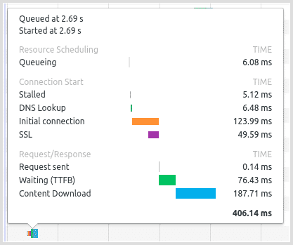
Image quality
Your images will be served as WebP images in case the browser supports WebP. Otherwise, JPEG or PNG images will be served. Image quality is 80% by default and can be adjusted.
In order to serve smaller, faster images, reduce the image quality by adding a quality value to the URL. For example, this code sets a JPEG quality of 70%:
<div class="Sirv" data-effect="zoom">
  <img data-src="https://demo.sirv.com/test-bike.jpg?quality=70"/>
</div>
Here's how 70% quality looks (you may notice more artefacts in the JPEG image, around the areas of high contrast):

Expert support
For help from a Sirv expert, contact the support team from your Sirv account.
If you don't have a Sirv account yet, join now.