Sirv Media Viewer
About
Sirv Media Viewer is a beautiful viewer for images, videos and 360 spins. It intelligently resizes assets to suit each users screen and lazy loads them from Sirv's CDN. Thumbnails are autogenerated and all options are highly customizable. Use it to serve one or multiple assets.
Example with zoomable images, 360 spin and video:
Usage
It's easy to embed Sirv Media Viewer in your page.
1. Copy and paste the Sirv JS script anywhere in your HTML, usually before the </head> or the </body>:
<script src="https://scripts.sirv.com/sirvjs/v3/sirv.js"></script>
For the best optimization, change that to a smaller version of Sirv JS.
2. Add a div with class of "Sirv", containing more divs for each of your assets. This example contains one spin, one zoomable image and one video:
<div class="Sirv">
 <div data-src="https://demo.sirv.com/example.spin"></div>
 <div data-src="https://demo.sirv.com/image.jpg" data-type="zoom"></div>
 <div data-src="https://demo.sirv.com/video.mp4"></div>
</div>
Alteratively, you can reference each asset in a single div.
Configuration wizard
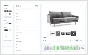 Try all the settings via the Sirv Media Viewer configuration wizard.
You can choose what media to be shown, from images, videos, 360 spins or 3D models. Choose from one item to many items. Play with the options and see the HTML code or script to embed the viewer in your web page.
Options
Adjust the experience with over 30 options, plus zoom, spin, video and responsive image options.
| Parameter | Default | Options | Description |
|---|---|---|---|
| quality | 80 | 0-100 (%) | Quality of standard images. |
| hdQuality | 60 | 0-100 (%) | Quality of hi-res images (retina). |
| threshold | 0 | numeric (px) | Distance below viewport when responsive images should load. |
| arrows | true | true, false | Display arrows to the left/right of the image. |
| orientation | horizontal | horizontal, vertical | Position of arrows. |
| loop | true | true, false | Loop from the last image to the first image. |
| autostart | visible | visible, created, off | When to load images. |
| itemsOrder | zoom, spin, video, model, image | Order of assets in the gallery. | |
| Thumbnails | |||
| thumbnails.enable | true | true, false | Display thumbnail for each item. |
| thumbnails.size | 70 | numeric (px) | Thumbnail height/width. |
| thumbnails.position | bottom | bottom, top, left, right | Thumbnail location, relative to main image. |
| thumbnails.trigger | click | click, hover | Thumbnail activation on hover of click. |
| thumbnails.type | square | square, crop, auto, bullets, grid | Style of thumbnails. |
| thumbnails.target | false | true, false | Trigger thumbnail from query selector. |
| thumbnails.always | false | true, false | Always show thumbnail even if viewer has 1 item only. |
| thumbnails.watermark | true | true, false | Show watermark on thumbnail. |
| thumbnails.align | center | center, start | Positioning of thumbnails in the scroll area. |
| Slider | |||
| slide.animation.type | fade | fade, slide, off | Style of animation. |
| slide.animation.duration | 200 | numeric (ms) | Duration of animation effect. |
| slide.autoplay | false | true, false | Automatically slide the images in a slideshow. |
| slide.delay | 3000 | numeric (ms) | Time between each autoslide. |
| slide.first | 0 | numeric | First slide to play (from 0 upwards). |
| slide.preload | true | true, false | Preload the images, to remove any loading delay. |
| Fullscreen | |||
| fullscreen.always | false | true, false | Go immediately to fullscreen on click. |
| fullscreen.native | false | true, false | Use entire fullscreen instead of page fullscreen. |
| fullscreen.enable | true | true, false | Enable option to go fullscreen. |
| fullscreen.history | true | true, false | Exit fullscreen with browser back button. |
| fullscreen.thumbnails.size | auto | auto or number (px) | Dimensions of fullscreen thumbnails. |
| fullscreen.thumbnails.position | bottom | bottom, top, left, right | Location of fullscreen thumbnails. |
| fullscreen.thumbnails.trigger | auto | auto, click, hover | Method for triggering thumbnail. |
| fullscreen.thumbnails.type | square | square, auto, bullets | Style of fullscreen buttons. |
| fullscreen.thumbnails.autohide | false | true, false | Hide the thumbnails discreetly. |
| fullscreen.thumbnails.enable | true | true, false | Show thumbnails in fullscreen mode. |
| fullscreen.thumbnails.always | false | true, false | Always show thumbnail even if viewer has 1 item only. |
| fullscreen.thumbnails.watermark | true | true, false | Show watermark on thumbnail. |
| Context menu | |||
| contextmenu.enable | false | true, false | Enable the context menu on right-click. |
| contextmenu.text.zoom.in | Zoom in | Change the text for zoom in. | |
| contextmenu.text.zoom.out | Zoom out | Change the text for zoom out. | |
| contextmenu.text.fullscreen.enter | Enter Full Screen | Change the text to enter fullscreen. | |
| contextmenu.text.fullscreen.exit | Exit Full Screen | Change the text to exit fullscreen. | |
| contextmenu.text.download | Download image | Change the text for download. | |
| Layout | |||
| layout.type | slider | slider / grid | Gallery layout style. |
| layout.aspectRatio | auto | auto or number | Aspect ratio of item(s) e.g. 1/1, 16/9, 0.75. |
| layout.grid.columns | 2 | Number of columns in the grid, minimum 1. | |
| layout.grid.gap | 20 | numeric (px) | Spacing between items in the grid. |
Applying options
Options can be applied to each image individually (div) or to all instances on the page (script).
Options in a div
Use the data-options tag to apply options in the relevant div. There is a containing div for the viewer, then a div for each asset (image, video or spin):
<div class="Sirv" data-options="fullscreen.enable:false;">
 <div data-src="https://demo.sirv.com/example.spin" data-options="inactivity:7000;"></div>
 <div data-src="https://demo.sirv.com/image.jpg" data-type="zoom" data-options="mode:right;"></div>
 <div data-src="https://demo.sirv.com/video.mp4" data-options="autoplay:true;"></div>
</div>
Options in a script
To apply options to every instance in your page or site, use a script, for example:
<script>
 var SirvOptions = {
  viewer: {
   spin: {
    inactivity: 7000,
   },
   zoom: {
    mode: 'right',
   },
   video: {
    autoplay: true,
   }
  }
 }
</script>
Quality
Images in Sirv Media Viewer use the following quality by default:
- quality - 80% for standard images
- hdQuality - 60% for hi-res images (retina screens)
Adjust the image quality with the quality and hdQuality parameters. For example, raise the quality to 90% and 80% like so:
<script>
var SirvOptions = {
 viewer: {
  quality: 90,
  hdQuality: 80,
 }
}
</script>
Or set it inline, like so:
<div class="Sirv" data-options="quality:90; hdQuality:80">
 <div data-src="https://demo.sirv.com/demo/apt/01.jpg" data-type="zoom"></div>
 <div data-src="https://demo.sirv.com/demo/apt/02.jpg" data-type="zoom"></div>
 etc.
</div>
Threshold
Images are lazy-loaded, meaning that they only load if and when they come into view. You can load them slightly earlier, when they reach a certain distance from the viewport, by setting threshold to a value. This will load the images 200px before they enter the viewport:
<div class="Sirv" data-options="threshold:200">
 <div data-src="https://demo.sirv.com/demo/apt/01.jpg" data-type="zoom"></div>
 <div data-src="https://demo.sirv.com/demo/apt/02.jpg" data-type="zoom"></div>
</div>
<script>
var SirvOptions = {
 viewer: {
  threshold: 200
 }
}
</script>
Autostart
The images lazy load by default, when they enter the viewport. This avoids unnecessary data transfer, loading images further down the page that aren't needed.
- visible - images lazy load when they enter the viewport (default).
- created - images load immediately (on page load or upon API creation).
- off - images don't load until you start them with the API.
<div class="Sirv" data-options="autostart:off">
 <div data-src="https://demo.sirv.com/demo/apt/01.jpg" data-type="zoom"></div>
 <div data-src="https://demo.sirv.com/demo/apt/02.jpg" data-type="zoom"></div>
</div>
<script>
var SirvOptions = {
 viewer: {
  autostart: 'off'
 }
}
</script>
Order of items
The order of thumbnails will follow the order of each <div> in your code. You can change this order by applying the itemsOrder parameter. It can specify the type of asset you want to show first, second, third etc.
The options are zoom, spin, video, model, image where zoom is a zoomable image and image is a static image. If such an asset doesn't exist in the gallery, it will be skipped.
The following example will show a spin first, then a zoomable image, then a video.
<div class="Sirv" data-options="itemsOrder:spin, zoom, video">
 <div data-src="https://demo.sirv.com/example.jpg" data-type="zoom"></div>
 <div data-src="https://demo.sirv.com/example.mp4"></div>
 <div data-src="https://demo.sirv.com/example.spin"></div>
</div>
<script>
var SirvOptions = {
 viewer: {
  itemsOrder:: ['spin, zoom, video']
 }
}
</script>
You can change the order of items with even greater control, including removing or adding assets to the gallery. Refer to the content filtering documentation.
Grid gallery
Grid layout is a popular alternative to a classic thumbnail gallery. A grid gallery shows items in columns. It is very configurable - any number of columns or even different number of columns per row.
To enable grid layout, set this parameter layout.type:grid.
Specify the number of columns with layout.grid.columns:2. Values can be from 1 to 10.
You can set the aspect ratio of assets by setting layout.aspectRatio:auto. Make the assets square with 1/1 or wide with 16/9. Any value is possible.
Adjust the spacing between each asset with layout.grid.gap:20. Any value is possible, in pixels.
This example displays a 2 column grid with 1/1 aspect ratio and 15px spacing:
The code looks like this:
<div class="Sirv" data-options="layout.type:grid; layout.aspectRatio:1/1; layout.grid.columns:2; layout.grid.gap:15">
 <div data-src="https://demo.sirv.com/demo/p-6000/spin/spin.spin"></div>
 <div data-src="https://demo.sirv.com/demo/p-6000/p-6000-1.jpg" data-type="zoom"></div>
 <div data-src="https://demo.sirv.com/demo/p-6000/p-6000-2.jpg" data-type="zoom"></div>
 <div data-src="https://demo.sirv.com/demo/p-6000/p-6000-3.jpg" data-type="zoom"></div>
 <div data-src="https://demo.sirv.com/demo/p-6000/p-6000.mp4" data-options="autoplay:true; loop:true; controls.enable:false"></div>
 <div data-src="https://demo.sirv.com/demo/p-6000/p-6000-4.jpg" data-type="zoom"></div>
</div>
<script>
var SirvOptions = {
 viewer: {
  layout: {
   type: 'grid',
   aspectRatio: '1/1',
   columns: '2',
   gap: '15'
  }
 }
}
</script>
On small screens, such as smartphones, a lot of scrolling can be required if images are in a long column. To improve the user experience, slider layout (with thumbnails) will be automatically applied if the shortest dimension of a screen is less than 768px.
Try the grid gallery settings yourself with the Sirv Media Viewer generator.
Slider gallery
Adjust how the main image animates between slides.
Slide animation
This animation style can be set to slide.animation.type to fade, slide or off. Off changes the image instantly:
Fade (default):
Slide:
Off:
<div class="Sirv" data-options="slide.animation.type:slide">
 <div data-src="https://demo.sirv.com/demo/apt/01.jpg"></div>
 <div data-src="https://demo.sirv.com/demo/apt/02.jpg"></div>
 <div data-src="https://demo.sirv.com/demo/apt/03.jpg"></div>
</div>
<script>
var SirvOptions = {
 viewer: {
  slide: {
   animation: {
    type: 'slide'
   }
  }
 }
}
</script>
The animation speed can be changed by adjusting slide.animation.duration:
100 ms:
200 ms (default):
500 ms:
<div class="Sirv" data-options="slide.animation.duration:500">
 <div data-src="https://demo.sirv.com/demo/apt/01.jpg"></div>
 <div data-src="https://demo.sirv.com/demo/apt/02.jpg"></div>
 <div data-src="https://demo.sirv.com/demo/apt/03.jpg"></div>
</div>
<script>
var SirvOptions = {
 viewer: {
  slide: {
   animation: {
    duration: 500
   }
  }
 }
}
</script>
Slide autoplay
The slider can automatically move from one image to the next. Set slide.autoplay to true:
Disable the thumbnails with thumbnails.enable:false and it becomes a slideshow:
Adjust the time each slide shows by setting slide.delay to a longer or shorter duration:
2000 ms:
5000 ms:
<div class="Sirv" data-options="thumbnails.enable:false; slide.autoplay:true; slide.delay:2000">
 <div data-src="https://demo.sirv.com/demo/apt/01.jpg"></div>
 <div data-src="https://demo.sirv.com/demo/apt/02.jpg"></div>
 <div data-src="https://demo.sirv.com/demo/apt/03.jpg"></div>
</div>
<script>
var SirvOptions = {
 viewer: {
  thumbnails: {
   enable: false
  },
  slide: {
   autoplay: true,
   delay: 2000
  }
 }
}
</script>
First slide
Change the first image to be shown. It is 0 by default (for the first image). Change slide.first to another value:
<div class="Sirv" data-options="slide.first:2">
 <div data-src="https://demo.sirv.com/demo/apt/01.jpg"></div>
 <div data-src="https://demo.sirv.com/demo/apt/02.jpg"></div>
 <div data-src="https://demo.sirv.com/demo/apt/03.jpg"></div>
</div>
<script>
var SirvOptions = {
 viewer: {
  slide: {
   first: 2
  }
 }
}
</script>
Preload slides
The slides will preload, so that there is no delay in showing other images. You can disable this by setting slide.preload to false:
<div class="Sirv" data-options="slide.preload:false">
  <div data-src="https://demo.sirv.com/demo/apt/01.jpg"></div>
  <div data-src="https://demo.sirv.com/demo/apt/02.jpg"></div>
  <div data-src="https://demo.sirv.com/demo/apt/03.jpg"></div>
</div>
<script>
var SirvOptions = {
 viewer: {
  slide: {
   preload: false
  }
 }
}
</script>
Click to open URL
It's possible to link to a URL on click of an image in the slider.
Wrap an <a> tag around the <img> tag, like so:
<div class="Sirv" data-options="slide.animation.type:slide">
 <div><a href="https://example.com/"><img data-src="https://demo.sirv.com/demo/apt/01.jpg"></a></div>
 <div><a href="https://example.com/" target="_blank" rel="noopener noreferrer"><img data-src="https://demo.sirv.com/demo/apt/02.jpg"></a></div>
 <div><a href="https://example.com/" target="_blank" rel="noopener noreferrer"><img data-src="https://demo.sirv.com/demo/apt/03.jpg"></a></div>
</div>
Arrows
Arrows appear to the left and right, to move to the next/previous image. They can be disabled by setting the arrows parameter to false.
To demonstrate this clearly, zoom has been disabled and thumbnails replaced with bullets:
Arrows on hover:
No arrows:
The code looks like this:
<div class="Sirv" data-options="arrows:false; thumbnails.type:bullets">
 <div data-src="https://demo.sirv.com/demo/apt/01.jpg"></div>
 <div data-src="https://demo.sirv.com/demo/apt/02.jpg"></div>
</div>
<script>
var SirvOptions = {
 viewer: {
  arrows: false,
  thumbnails: {
    type: bullets
    }
  }
}
</script>
Orientation
Arrows appear left and right by default. Instead, they can be shown top and bottom, by setting orientation to vertical:
Arrows left / right:
Arrows top / bottom:
The code looks like this:
<div class="Sirv" data-options="orientation:vertical; thumbnails.enable:false">
 <div data-src="https://demo.sirv.com/demo/apt/01.jpg"></div>
 <div data-src="https://demo.sirv.com/demo/apt/02.jpg"></div>
</div>
<script>
var SirvOptions = {
 viewer: {
  orientation: 'vertical',
  thumbnails: {
    enable: false
    }
  }
}
</script>
Loop
The slider will continue to the first image after showing the last image. This can be stopped by setting the loop parameter to false:
Loop:
No loop:
The code looks like this:
<div class="Sirv" data-options="loop:false; thumbnails.type:bullets">
 <div data-src="https://demo.sirv.com/demo/apt/01.jpg"></div>
 <div data-src="https://demo.sirv.com/demo/apt/02.jpg"></div>
</div>
<script>
var SirvOptions = {
 viewer: {
  loop: false,
  thumbnails: {
    type: bullets
    }
 }
}
</script>
Thumbnails
Sirv Media Viewer automatically displays thumbnails, to allow swapping between assets. Thumbnail galleries are highly configurable to meet your exact requirements.
Thumbnail layout
The layout can be changed by setting thumbnails.type to any of these options:
- square - Scale thumbnails to fit height/width
- crop - Crop thumbnails square
- auto - Scale thumbnails to fit height
- bullets - Bulleted dots
- grid - Wrap thumbnails into rows
Square:
Crop:
Auto:
Bullets:
Grid thumbs (wrapped):
The code looks like this:
<div class="Sirv" data-options="thumbnails.type:bullets">
 <div data-src="https://demo.sirv.com/demo/apt/01.jpg" data-type="zoom"></div>
 <div data-src="https://demo.sirv.com/demo/apt/02.jpg" data-type="zoom"></div>
 <div data-src="https://demo.sirv.com/demo/apt/03.jpg" data-type="zoom"></div>
</div>
<script>
var SirvOptions = {
 viewer: {
  thumbnails: {
   type: 'bullets'
  }
 }
}
</script>
Thumbnail position
Thumbnails are shown underneath by default. They can be moved to the left, right or top with the thumbnails.position parameter:
<div class="Sirv" data-options="thumbnails.position:left">
 <div data-src="https://demo.sirv.com/demo/apt/01.jpg" data-type="zoom"></div>
 <div data-src="https://demo.sirv.com/demo/apt/02.jpg" data-type="zoom"></div>
 <div data-src="https://demo.sirv.com/demo/apt/03.jpg" data-type="zoom"></div>
 <div data-src="https://demo.sirv.com/demo/apt/04.jpg" data-type="zoom"></div>
 <div data-src="https://demo.sirv.com/demo/apt/05.jpg" data-type="zoom"></div>
 <div data-src="https://demo.sirv.com/demo/apt/06.jpg" data-type="zoom"></div>
</div>
<script>
var SirvOptions = {
 viewer: {
  thumbnails: {
   position: 'left'
  }
 }
}
</script>
Thumbnails are sized automatically. Instead, you can set a size in px with the thumbnails.size parameter. This will set thumbnails with 110px height:
<div class="Sirv" data-options="thumbnails.size:110">
 <div data-src="https://demo.sirv.com/demo/apt/01.jpg" data-type="zoom"></div>
 <div data-src="https://demo.sirv.com/demo/apt/02.jpg" data-type="zoom"></div>
</div>
<script>
var SirvOptions = {
 viewer: {
  thumbnails: {
   size: 110
  }
 }
}
</script>
Thumbnails are aligned in the center, relative to the main image. Instead, they can be aligned to the left (if thumbnails are above/below the main image) or to the top (if thumbnails are aligned to the left/right). Set the thumbnails.align parameter to start.
Hide thumbnails
Thumbnails can be removed by setting thumbnails.enable to false:
<div class="Sirv" data-options="thumbnails.enable:false">
 <div data-src="https://demo.sirv.com/demo/apt/01.jpg"></div>
 <div data-src="https://demo.sirv.com/demo/apt/02.jpg"></div>
 <div data-src="https://demo.sirv.com/demo/apt/03.jpg"></div>
</div>
<script>
var SirvOptions = {
 viewer: {
  thumbnails: {
   enable: false
  }
 }
}
</script>
Hover to swap
Instead of clicking to swap between thumbnails, you can swap them on hover by setting thumbnails.trigger to hover:
<div class="Sirv" data-options="thumbnails.trigger:hover; fullscreen.thumbnails.trigger:hover">
 <div data-src="https://demo.sirv.com/demo/apt/01.jpg"></div>
 <div data-src="https://demo.sirv.com/demo/apt/02.jpg"></div>
 <div data-src="https://demo.sirv.com/demo/apt/03.jpg"></div>
</div>
<script>
var SirvOptions = {
 viewer: {
  thumbnails: {
   trigger: 'hover',
  },
  fullscreen: {
   thumbnails: {
    trigger: 'hover'
  },
 }
}
</script>
Fullscreen thumbnails use the setting auto to inherit the main thumbnail setting. If you want to set a different trigger for fullscreen thumbnails, apply the fullscreen.thumbnails.trigger parameter with either hover or click.
Pinned thumbnails
Important thumbnails can be pinned to the beginning or end of the carousel, so they don't scroll with the other thumbnails. The first thumbnail below has been pinned:
Add the attribute data-pinned="start" or data-pinned="end" to pin an item.
Example:
<div class="Sirv">
 <div data-src="https://demo.sirv.com/demo/apt/01.jpg" data-pinned="start"></div>
 <div data-src="https://demo.sirv.com/demo/apt/02.jpg"></div>
 <div data-src="https://demo.sirv.com/demo/apt/03.jpg"></div>
 <div data-src="https://demo.sirv.com/demo/apt/04.jpg"></div>
 <div data-src="https://demo.sirv.com/demo/apt/05.jpg"></div>
 <div data-src="https://demo.sirv.com/demo/apt/06.jpg"></div>
</div>
Custom thumbnails
You can show a completely different thumbnail of your choice. There are many possible uses, for example:
- Show a different image thumb to the main image
- Show text instead of image thumbs
- Show fewer thumbnails and open extras in fullscreen
- Show an extra thumbnail that links to another part of the page
- See working examples
Replace thumbnail with image
To replace a thumbnail with another image, add the tag smv-thumbnail after the item, with an img:
<div data-src="https://your-account.sirv.com/products/product.spin">
 <smv-thumbnail>
  <img data-src="https://your-account.sirv.com/thumbnail-of-your-choice.jpg" alt="Descriptive text here">
 </smv-thumbnail>
</div>
Replace thumbnail with text
To replace a thumbnail, add the tag smv-thumbnail after the item. The example below would replace the image thumbnail with the text "Spin":
<div data-src="https://your-account.sirv.com/products/product.spin">
 <smv-thumbnail>
  <span>Spin</span>
 </smv-thumbnail>
</div>
The example below replaces the 3 image thumbnails with text Spin, Zoom and Video:
Spin
Zoom
Video
The code looks like this:
<style>
 .sirv-text-thumbnails smv-thumbnail[data-type="html"] {
  width: auto !important;
  height: auto !important;
  border: 0 !important;
  text-transform: uppercase;
  padding: 18px 36px;
  font-size: 18pt;
 }
 .sirv-text-thumbnails .smv-item.smv-active smv-thumbnail[data-type="html"] {
  font-weight: bold;
 }
</style>
<div class="Sirv sirv-text-thumbnails">
 <div data-src="https://demo.sirv.com/demo/snug/teal.spin">
  <smv-thumbnail>
   <span>Spin</span>
  </smv-thumbnail>
 </div>
 <div data-src="https://demo.sirv.com/demo/snug/unpacked.jpg" data-type="zoom">
  <smv-thumbnail>
   <span>Zoom</span>
  </smv-thumbnail>
 </div>
 <div data-src="https://demo.sirv.com/demo/snug/sofa-build.mp4">
  <smv-thumbnail>
   <span>Video</span>
  </smv-thumbnail>
 </div>
</div>
Thumbnail events
You can create your own behavior by handling the click on a custom thumbnail. Add an event listener to the thumbnailClick event.
Example:
Sirv.on('viewer:thumbnailClick', function (item) {
 if (item.thumbnail.dataset.customAction === 'enterFullscreen') {
  item.parent().fullscreen();
 }
});
Thumbnail watermark
The watermark automatically shows on the main image and its thumbnail.
To remove the watermark from your thumbnail images set thumbnails.watermark and fullscreen.thumbnails.watermark to false.
<div class="Sirv" data-options="thumbnails.watermark:false; fullscreen.thumbnails.watermark:false">
<div data-type="zoom" data-src="https://demo.sirv.com/demo/apt/01.jpg?watermark=/watermark-v1.png&watermark.canvas.border.height=20%&watermark.scale.width=10%&watermark.rotate=-20&watermark.position=tile"></div>
<div data-type="zoom" data-src="https://demo.sirv.com/demo/apt/02.jpg?watermark=/watermark-v1.png&watermark.canvas.border.height=20%&watermark.scale.width=10%&watermark.rotate=-20&watermark.position=tile"></div>
</div>
<script>
var SirvOptions = {
 viewer: {
  thumbnails: {
   watermark: false
  },
  fullscreen: {
   thumbnails: {
    watermark: false
   }
  }
 }
}
</script>
Fullscreen
A fullscreen icon in the top right permits big, detailed images.
Instant fullscreen
To instantly launch fullscreen on click, set fullscreen.always to true. (It will also enable immediate fullscreen if data-type="zoom" is not applied.)
<div class="Sirv" data-options="fullscreen.always:true">
  <div data-src="https://demo.sirv.com/demo/apt/01.jpg" data-type="zoom"></div>
</div>
<script>
var SirvOptions = {
 viewer: {
  fullscreen: {
   always: true
  }
 }
}
</script>
Fullscreen size
There are two types of fullscreen:
- Viewport - within the browser window.
- Native - the entire screen.
The viewport is used by default. To use native fullscreen, set fullscreen.native to true:
<div class="Sirv" data-options="fullscreen.native:true">
  <div data-src="https://demo.sirv.com/demo/snug/pink-shadow.jpg" data-type="zoom"></div>
</div>
<script>
var SirvOptions = {
  viewer: {
    fullscreen: {
      native: true
    }
  }
}
</script>
Viewport
Native
Disable fullscreen
To disable fullscreen and hide the button, set fullscreen.enable to false:
<div class="Sirv" data-options="fullscreen.enable:false">
 <div data-src="https://demo.sirv.com/demo/apt/01.jpg"></div>
 <div data-src="https://demo.sirv.com/demo/apt/02.jpg"></div>
 <div data-src="https://demo.sirv.com/demo/apt/03.jpg"></div>
</div>
<script>
var SirvOptions = {
  viewer: {
    fullscreen: {
      enable: false
    }
  }
}
</script>
Fullscreen thumbnails
Thumbnails in fullscreen will be automatically sized. Instead, you can set a specific size in px with the fullscreen.thumbnails.size parameter. This will set 150px:
<div class="Sirv" data-options="fullscreen.thumbnails.size:150">
 <div data-src="https://demo.sirv.com/demo/apt/01.jpg"></div>
 <div data-src="https://demo.sirv.com/demo/apt/02.jpg"></div>
 <div data-src="https://demo.sirv.com/demo/apt/03.jpg"></div>
</div>
<script>
var SirvOptions = {
 viewer: {
  fullscreen: {
   thumbnails: {
    size: 150
   }
  }
 }
}
</script>
150px
80
Thumbnails are shown to the bottom by default. Instead, they can be shown to the top, left or right with the fullscreen.thumbnails.position parameter:
<div class="Sirv" data-options="fullscreen.thumbnails.position:left">
 <div data-src="https://demo.sirv.com/demo/apt/01.jpg"></div>
 <div data-src="https://demo.sirv.com/demo/apt/02.jpg"></div>
 <div data-src="https://demo.sirv.com/demo/apt/03.jpg"></div>
</div>
<script>
var SirvOptions = {
 viewer: {
  fullscreen: {
   thumbnails: {
    position: 'left'
   }
  }
 }
}
</script>
Left
Top
Right
Fullscreen thumbnails are square by default. You can change the style by setting fullscreen.thumbnails.type to any of these options:
- square - Square thumbnails
- auto - Original aspect ratio thumbnails
- bullets - Bulleted dots
<div class="Sirv" data-options="fullscreen.thumbnails.type:left">
 <div data-src="https://demo.sirv.com/demo/apt/01.jpg"></div>
 <div data-src="https://demo.sirv.com/demo/apt/02.jpg"></div>
 <div data-src="https://demo.sirv.com/demo/apt/03.jpg"></div>
</div>
<script>
var SirvOptions = {
 viewer: {
  fullscreen: {
   thumbnails: {
    type: 'left'
   }
  }
 }
}
</script>
Square
Auto
Bullets
To hide the thumbnails until the user moves their mouse down, set fullscreen.thumbnails.autohide to true:
<div class="Sirv" data-options="fullscreen.thumbnails.autohide:true">
  <div data-src="https://demo.sirv.com/demo/apt/01.jpg"></div>
  <div data-src="https://demo.sirv.com/demo/apt/02.jpg"></div>
  <div data-src="https://demo.sirv.com/demo/apt/03.jpg"></div>
</div>
<script>
var SirvOptions = {
 viewer: {
  fullscreen:{
   thumbnails: {
    autohide: true
   }
  }
 }
}
</script>
To remove thumbnails from fullscreen view, set fullscreen.thumbnails.enable to false:
<div class="Sirv" data-options="fullscreen.thumbnails.enable:false">
  <div data-src="https://demo.sirv.com/demo/apt/01.jpg"></div>
</div>
<script>
var SirvOptions = {
 viewer: {
  fullscreen:{
   thumbnails:{
    enable: false
   }
  }
 }
}
</script>
Fullscreen icon
A variety of fullscreen icons are available:
The icons are numbered from 01 to 18. Apply one of the icons by adding some CSS to your web page, like so:
<style>
.smv-button-fullscreen-open .smv-icon {
  -webkit-mask-image: url(https://scripts.sirv.com/sirvjs/v3/graphics/buttons/fullscreen.07.svg) !important;
  background-color: #4aafe3;
}
</style>
Change the color of the icon with the background-color attribute.
The quickest way to adjust fullscreen icon is in the CSS > Fullscreen section of the Sirv Media Viewer interactive demo.
Alternatively, you could design your own square SVG (or PNG) icon and apply it with CSS, like so:
<style>
.smv-button-fullscreen-open .smv-icon {
  -webkit-mask-image: url(https://your-account.sirv.com/icons/your-new-icon.svg) !important;
}
</style>
Context menu
The right-click context menu is disabled by default. Enable it by setting contextmenu.enable tag to true:
<div class="Sirv" data-options="contextmenu.enable:true;">
  <div data-src="https://demo.sirv.com/example.spin"></div>
</div>
<script>
var SirvOptions = {
  viewer: {
    contextmenu: {
      enable: true
    }
  }
}
</script>
To change any text in the context menu, apply these parameters:
- contextmenu.text.zoom.in - text for zooming in
- contextmenu.text.zoom.out - text for zooming out
- contextmenu.text.fullscreen.enter - text for going into fullscreen
- contextmenu.text.fullscreen.exit - text for leaving fullscreen
- contextmenu.text.download - text for downloading the image
  <div class="Sirv" data-options="contextmenu.enable:true; contextmenu.text.zoom.in:Click here to zoom">
  <div data-src="https://demo.sirv.com/example.spin"></div>
</div>
<script>
var SirvOptions = {
  viewer: {
    contextmenu: {
      enable: true,
      text: {
        zoom: {
          in: 'Click here to zoom'
        }
      }
    }
  }
}
</script>
Groups
Groups let you show/hide multiple items at a time.
Apply one or more groups to an item with the data-group attribute. Example:
<div class="Sirv" id="example-viewer-1">
 <div data-src="https://demo.sirv.com/demo/sirv-media-viewer/ralphlauren/featherweight-shirt-navy-1.jpg" data-group="color-navy, size-s, size-m, size-l"></div>
 <div data-src="https://demo.sirv.com/demo/sirv-media-viewer/ralphlauren/featherweight-shirt-navy-1.jpg" data-group="color-navy, size-s, size-m, size-l"></div>
 <div data-src="https://demo.sirv.com/demo/sirv-media-viewer/ralphlauren/featherweight-shirt-brown-1.jpg" data-group="color-brown, size-m, size-l, size-xl"></div>
 <div data-src="https://demo.sirv.com/demo/sirv-media-viewer/ralphlauren/featherweight-shirt-brown-1.jpg" data-group="color-brown, size-s, size-m, size-l"></div>
 <div data-src="https://demo.sirv.com/demo/sirv-media-viewer/ralphlauren/featherweight-shirt-yellow-1.jpg" data-group="color-yellow, size-s, size-m"></div>
 <div data-src="https://demo.sirv.com/demo/sirv-media-viewer/ralphlauren/featherweight-shirt-yellow-1.jpg" data-group="color-yellow, size-s, size-m"></div>
</div>
You can use the Sirv Media Viewer API to control which groups to show or hide. The relevant API methods are:
- .enableGroup()
- .disableGroup()
- .switchGroup()
These 3 examples will show/hide items in the gallery above:
<script>
  // Hide items in the "color-navy" group
  Sirv.getInstance('#example-viewer-1').disableGroup('color-navy');
  // Show items from the "color-brown" and "size-m" groups
  Sirv.getInstance('#example-viewer-1').enableGroup(['color-brown', 'size-m']);
  // Show items from the "color-yellow" group and hide all other items
  Sirv.getInstance('#example-viewer-1').switchGroup('color-yellow');
</script>
Mobile settings
To set different settings for mobile devices, use one of three ways to apply options. The examples below change the spin hint message to "Tap then drag".
Use a script to apply the settings to all instances on a page:
<script>
var SirvMobileOptions = {
  viewer: {
    spin: {
      hint: {
        message: {
          text: 'Tap then drag'
        }
      }
    }
  }
}
</script>
Alternatively, apply inline settings to Sirv Media Viewer:
<div data-src="https://demo.sirv.com/example.spin" class="Sirv" data-mobile-options="spin.hint.message.text: Tap then drag"></div>
Or apply inline settings to a specific item inside the viewer:
<div class="Sirv">
  <div data-src="https://demo.sirv.com/example.spin" data-mobile-options="hint.message.text: Tap then drag"></div>
</div>
Viewport breakpoints
Sirv Media Viewer viewport breakpoints allow you to configure different gallery settings for different screen sizes. With this, you can tailor the user experience to users on mobile, tablet or laptop devices.
Each breakpoint targets a different width for the gallery container. For example, you might want to show bullets instead of thumbnails on mobile devices.
Live demo: https://demo.sirv.com/demo/sirv-media-viewer/breakpoints/smv-breakpoints.html
Breakpoint example
Let's consider the PDP (product display page) of an online store. You may want to configure its gallery like so:
- Large viewport - 2-column grid gallery, with minimum column width of 300px. Autoplay videos in a loop, with controls disabled.
- Medium viewport - slider gallery, if container is less than 700px width. Thumbnails aligned left and autoplay videos when they become active.
- Small viewport - gallery with bullets below. Gallery goes fullscreen on tap/pinch.
You should write a script to define the breakpoints, as an array of Breakpoint objects. Example:
<script>
SirvOptions = {
  viewer: {
    breakpoints: [
      {
        /** Conditions **/
        match: {
          device: 'desktop' | ['tablet', 'phone'],
          width: max | [min, max], // Sirv Media Viewer container width
        },
        /** Sirv Media Viewer options to apply **/
        options: {
          thumbnails: {
            position: 'left',
          },
        },
      },
      {
        /** Custom rule via CSS Media Query **/
        match: '(pointer:coarse) && (orientation: portrait) and (max-device-width: 767px)',
        options: {},
      },
      {
        /** Custom rule via JavaScript function **/
        match: (smvWidth) => {
          return app.configurations.configA.active === true && smvWidth < 1024;
        },
        options: {},
      },
    ],
  },
};
</script>
In the example above, the following terms are used:
breakpoints - a list breakpoints, each one with a set of options to be applied when the conditions match.
device - a string or array of strings with 3 predefined values: desktop, tablet and phone.
width - the maximum width of Sirv Media Viewer container. This can be a number for maximum and/or minimum width or an array of numbers.
Advanced targetting
For even greater control, you can define your own matching rules with CSS Media Queries or JavaScript.
Example CSS Media Query:
{
  match: '(pointer:coarse) && (orientation: portrait) and (max-device-width: 767px)',
  options: {
  }
}
Example JavaScript:
{
  match: (smvWidth) => { return app.configurations.configA.active === true && smvWidth < 1024; },
  options: {
  }
}
The match function is invoked with a single argument that represents the current width of the SMV container.
The match function should return true or false.
Instance breakpoints
Viewport Breakpoints are the perfect way to show different gallery layouts to suit different screen sizes.
Try the examples and see the code in the Sirv Media Viewer breakpoint generator.
Breakpoints can be defined per instance via the data-breakpoints attribute of the gallery div. It accepts either JSON string (array of breakpoints) or a JavaScript variable name.
Setting the instance with JSON:
<div class="Sirv" data-breakpoints='[{"match":{"device":["tablet","iphone"],"width":560},"options":{"thumbnails":{"enable":false}}}]'>
Setting the instance with a JavaScript variable:
<script>
  var instanceBreakpoints = [
    {
      match: {
          device: ['tablet', 'iphone'],
          width: 560,
      },
      options: {
        thumbnails: {
          enable: false,
        },
      },
    },
  ];
</script>
Priority of settings
Viewport Breakpoints will supersede any settings you may have applied via data-mobile-options.
Viewport Breakpoints will override the standard gallery options set either globally or per instance. The priority is:
- viewer.data-options (lowest priority)
- item.data-options
- SirvOptions.breakpoints
- viewer.data-breakpoints (highest priority)
If more than one breakpoint matches, the more specific one is applied. For example, if the Sirv Media Viewer container is less than 600px width on tablet, the second breakpoint will be applied:
[
  {
    match: {
      device: ['tablet'],
    },
  },
  {
    match: {
      device: ['tablet'],
      width: 600,
    },
  },
]
YouTube/Vimeo videos in gallery
You can also add YouTube, Vimeo or other video URLs to galleries, by creating a .url file. The file should be in JSON format, like so:
{
 "title": "Enigma Evoke bike review on YouTube",
 "url": "https://www.youtube.com/watch?v=xx0EPhHX2U4"
}
Example file:
https://demo.sirv.com/Examples/Enigma/enigma-youtube.url
Refer to the file just like you would for an image or spin, for example:
<div class="Sirv">
 <div data-src="https://demo.sirv.com/image.jpg"></div>
 <div data-src="https://demo.sirv.com/example.spin"></div>
 <div data-src="https://demo.sirv.com/youtube-example.url"></div>
</div>
Additional attributes
The data-id attribute can be used to set a unique item name. The name can then be used to control the item via the API. For example this sets an id of my-item to the second image:
<div class="Sirv">
    <div data-src="https://demo.sirv.com/ian.jpg"></div>
    <div data-src="https://demo.sirv.com/jump.jpg" data-id="my-item"></div>
    <div data-src="https://demo.sirv.com/kitesurf.jpg"></div>
</div>
Then controlled va the API:
Sirv.on('viewer:ready', (viewer) => {
    let myslide = viewer.child('my-item');
});
The data-disabled attribute can exclude an item from the viewer. Disabled items can be included again via the API. Disabled items are not initilialized until enabled. For example:
<div class="Sirv" id="my-viewer">
    <div data-src="https://demo.sirv.com/ian.jpg"></div>
    <div data-src="https://demo.sirv.com/jump.jpg" data-id="my-item" data-disabled></div>
    <div data-src="https://demo.sirv.com/kitesurf.jpg"></div>
</div>
Then enabled by the API:
Sirv.viewer.getInstance('#my-viewer').enableItem('my-item');
Custom styling
You can modify Sirv Media Viewer's appearance by adjusting the CSS styles.
Use the Sirv Media Viewer interactive demo to choose your styles. It is the quickest way to generate the CSS code you require. Most of the popular styles can be configured there.
If you'd like to customize something not in the demo, your developer can identify which style to change or you can ask the Sirv support team for help.
Arrow styles
Arrow size, color, opacity and background can be changed with the following styles:
<style>
  .smv-h .smv-arrow .smv-icon {
    background-color: #FFF203;
    opacity: 0.55;
  }
  .smv-arrow-control .smv-arrow {
    background: rgba(251, 255, 123, 0.19) !important;
    height: 100px;
  }
</style>
The quickest way to adjust the arrow style is in the CSS > Arrows section of the Sirv Media Viewer interactive demo.
Style different viewers on same page
If you have multiple instances of Sirv Media Viewer on one page, they will all inherit the same CSS styles.
Normally you'd want all galleries to be styled in the same way but if you would like different styles per viewer, you can add an id to the div. Reference that id in your CSS.
The following example changes the fullscreen icon of viewers with an id of speakers:
<style>
  #speakers .smv-button-fullscreen-open .smv-icon {
    -webkit-mask-image: url(https://scripts.sirv.com/sirvjs/v3/graphics/buttons/fullscreen.10.svg) !important;
  }
  #speakers .smv .smv-button-fullscreen {
    width: 100px;
    height: 100px;
  }
</style>
<div class="Sirv" id="speakers" data-src="https://demo.sirv.com/image.jpg" data-type="zoom"></div>
Cursor styles
By default, the native browser cursors are shown on hover over an image, to indicate if an image can be zoomed or dragged. These cursors can be changed or removed by editing the following CSS classes:
<style>
.smv-cursor-zoom-in {
  cursor: zoom-in;
}

.smv-cursor-zoom-out {
  cursor: zoom-out;
}

.smv-cursor-dragging {
  cursor: move;
}
</style>
Multi-language
If you have a multi-language website, you can use JavaScript to localize text into the appropriate language for your site. This example would set different spin hint text for English and French languages:
<script>
// Define text for each language
var smvLocalization = {
  en: {
    spinHint: 'Drag to spin',
  },
  fr: {
    spinHint: 'Glisser pour pivoter'
  }
};

// Apply text corresponding to the current language
var SirvOptions = {
  viewer: {
    spin: {
      hint: {
        message: {
          text: smvLocalization[currentLanguage].spinHint
        }
      }
    }
  }
}
</script>
Alt text
alt tags are added to images/spins/videos if a description has been added to the asset in Sirv.
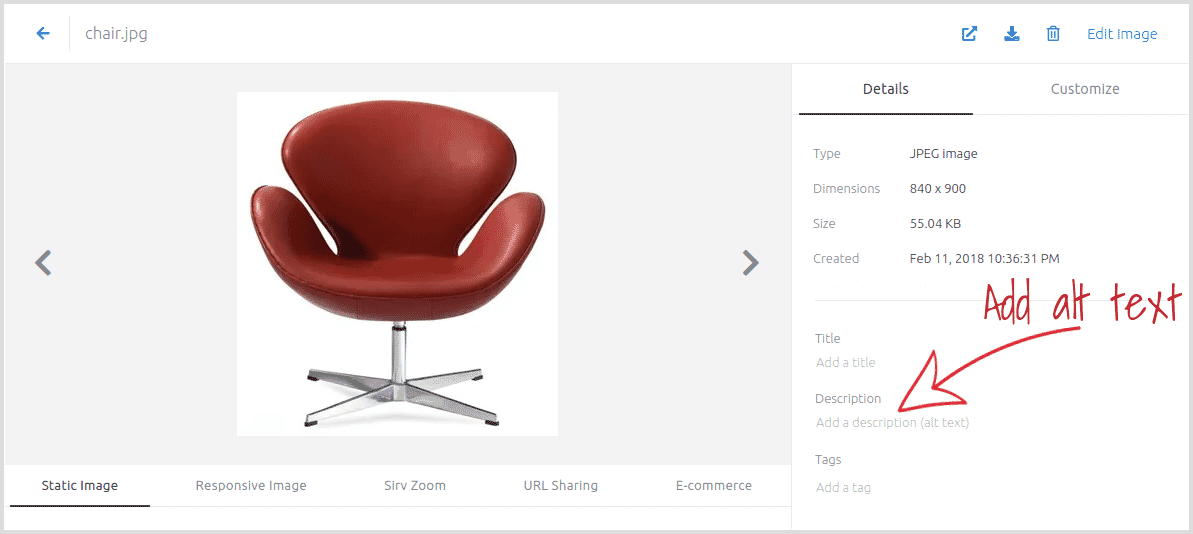
Alternatively, alt tags can be added via the data-alt attribute, for example:
<div class="Sirv">
  <div data-src="https://demo.sirv.com/example.spin" data-alt="Alt tag on spin"></div>
  <div data-src="https://demo.sirv.com/example.jpg" data-alt="Alt tag on zoomable image" data-type="zoom"></div>
  <div data-src="https://demo.sirv.com/example.mp4" data-alt="Alt tag on video"></div>
</div>
For accessibility, spins also have the additional attributes role="img" and aria-label="{alt text goes here}" added to the <canvas>.
Sirv Media Viewer also makes it easy for you to customize 15 aria-label attributes for your images and galleries, recommended by WCAG 2.0.
Faster initialization
To load images faster, you can do 3 things:
- Move sirv.js to the head
- Use pre-fetch and preconnect
- Load a smaller sirv.js version, with only the features you need
Move JS to the head
Your images, spins and videos are usually the most important items on your page, so give them top priority. Request the sirv.js file near the top of the <head> section of your HTML page. Ensure that it comes before any other script.
This will initiate requests for your images/spins/videos as soon as possible, typically improving their loading time by a few hundred ms or even 2+ seconds faster. This is especially true if your page contains many other JavaScript files.
Pre-fetch and preconnect
Prefetch the DNS and pre-initiate the connection to Sirv resources. This best-practice recommendation accelerates page loading and is automatically applied if you're using a Sirv plugin: Adobe Commerce CDN extension (formerly Magento), PrestaShop CDN addon or WordPress CDN plugin.
Paste the following code between the <head> and </head> of your HTML page, replacing your-sirv-account with your Sirv account name. If you use a custom domain, replace your-sirv-account.sirv.com with your custom domain:
<link rel="preconnect" href="https://scripts.sirv.com" crossorigin>
<link rel="preconnect" href="https://your-sirv-account.sirv.com" crossorigin>
<link rel="dns-prefetch" href="https://scripts.sirv.com">
<link rel="dns-prefetch" href="https://your-sirv-account.sirv.com">
Prefetch and preconnect can load your files 100-300 ms sooner for browsers that support preconnect. For browsers that only support DNS prefetch, files can load 10-150 ms sooner.
Load smaller sirv.js version
Your Sirv JS file will be smaller if you specify only the features you need. It will download faster and require less CPU resource to parse the file, which can improve your Core Web Vitals / Google PageSpeed score.
Choose from 6 features then append them with the modules parameter:
File size:
<script src="https://scripts.sirv.com/sirvjs/v3/sirv.js?modules=lazyimage,spin"></script>
Add assets in a single div
There is an alternative way to add assets to a gallery, using just one <div> tag, with comma-separated asset URLs. You can use this method to: add extra assets to a smart gallery; combine multiple smart galleries; or simply create a gallery using a single div instead of one div per asset.
Smart gallery with extra assets:
<div class="Sirv" data-src="https://demo.sirv.com/Examples/b74317.view, https://demo.sirv.com/Examples/warranty-2-year.png"></div>
Multiple smart galleries:
<div class="Sirv" data-src="https://demo.sirv.com/Examples/b74317.view, https://demo.sirv.com/Examples/Garmin.view"></div>
Multiple assets in one gallery:
<div class="Sirv" data-src="https://demo.sirv.com/example.spin, https://demo.sirv.com/image.jpg, https://demo.sirv.com/video.mp4"></div>
Referrer policy
It can be useful to know which URLs requested which files, so Sirv automatically applies the no-referrer-when-downgrade browser referral policy:
<img src="https://demo.sirv.com/example.jpg" referrerpolicy="no-referrer-when-downgrade">
That referrer policy tells the browser to include the full URL of the referring web page, instead of just the domain name. It is applied to all Sirv Media Viewer assets (images, spins and videos) and will help you troubleshoot any problems such as 404s or help you understand where particular requests originated from. These stats will be displayed on the Analytics section of your Sirv account.
To receive referral data for all images on your page (including those not requested via Sirv Media Viewer), consider applying this meta tag to your HTML page:
<meta name="referrer" content="no-referrer-when-downgrade" />
Credit
Special thanks to Gravity 360 for the beautiful product imagery of the Snug Shack sofa.