Responsive imaging
Always serve the most perfectly sized image by using Sirv responsive imaging. Sirv can automatically generate and serve the suitable size to any device and viewport.
Users with retina screens (HiDPI) screens will receive high-resolution images, with 4 times the number of pixels for beautiful clarity.
Responsive imaging is very easy when you use Sirv. Simply reference the sirv.js script and reference your img with a class of Sirv, for example:
<script src="https://scripts.sirv.com/sirvjs/v3/sirv.js"></script>

<img class="Sirv" data-src="https://demo.sirv.com/image.jpg">
If the screen is resized larger, Sirv triggers the creation of a new image, which is typically prepared in less than 0.1 second and then served to the users browser. If the resize is less than 50px, Sirv stretches the existing image, for instant resizing in the browser.
Examples
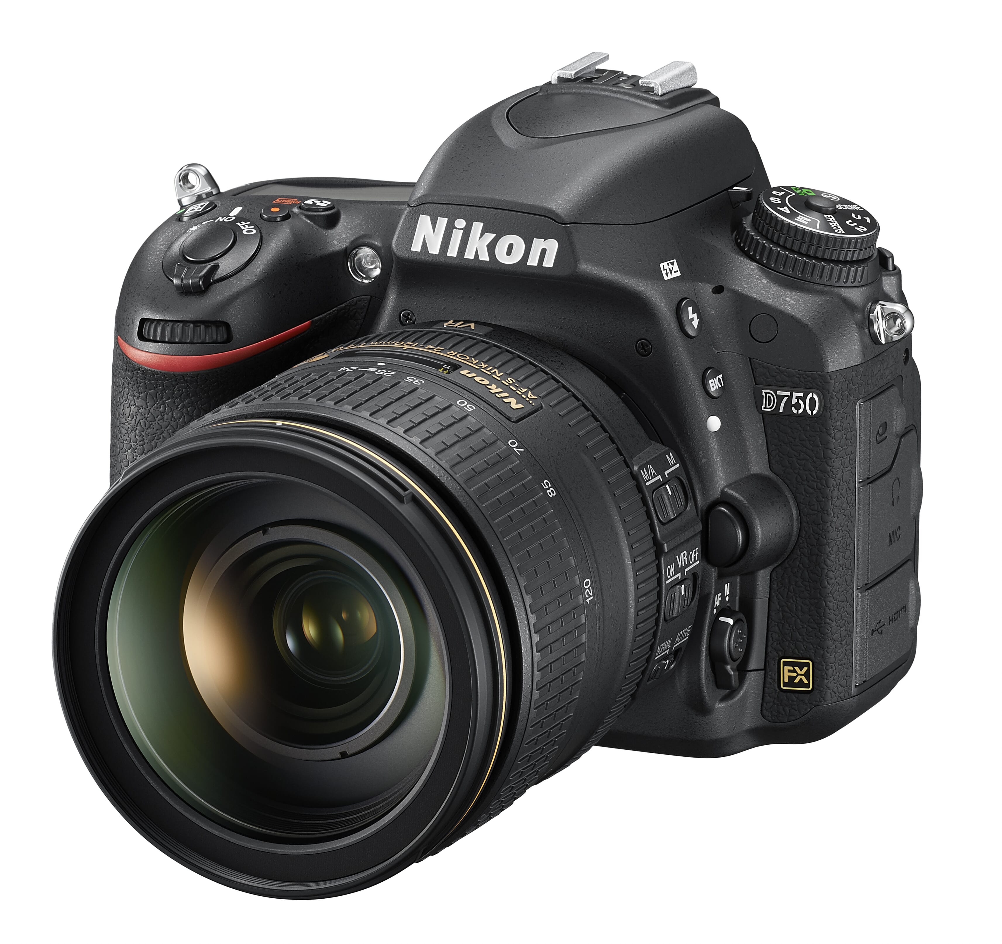
Try viewing these images on different devices. Try resizing your browser and see how new images are automatically created to fit the screen:
The images below use lazy loading, to save bandwidth and time: