Responsive imaging guide
Important: This documentation is for Sirv JS v2, which uses this script: https://scripts.sirv.com/sirv.js. We recommend using Sirv JS v3 instead. Go to the Sirv JS v3 responsive image documentation.
This documentation shows how to easily add responsive images to your websites/apps. For assistance, please contact support from your Sirv account. If you don't have a Sirv account yet, create your free account now.
Responsive images
Sirv can automatically deliver images to fit your users screen. Whether iPhone, iPad, mobiles, tablets or desktop/laptops, Sirv will detect the available dimensions and create an image to fit.
Sirv does this by resizing your image, caching it and rapidly delivering it to the user. Simple to setup, this is one of the easiest ways for web designers and developers to embed responsive images in web pages.

Setup
To use responsive imaging, follow these two steps:
1. Add class="Sirv" to your image and use data-src instead of src, for example:
<img data-src="https://demo.sirv.com/Model-X.jpg" class="Sirv">
2. Reference the sirv.js file, if it's not already in your page (it's the same file used for embedding zooms/spins):
<script src="https://scripts.sirv.com/sirv.js"></script>
Alternatively, use the lighter JavaScript file named sirv.nospin.js (without Sirv Spin). It is 32% smaller at 92KB (automatically served zipped at 39KB to the browser):
<script src="https://scripts.sirv.com/sirv.nospin.js"></script>
Cropped, responsive images
You can add other dynamic image effects to your responsive images. All of Sirv's 70+ dynamic imaging options are available.
For example, you can create a full width responsive image that is cropped to a certain height (in % or px). The example below is 200px height. While the width will change depending on the size of the users screen, the height will remain the same:

<img data-src="https://demo.sirv.com/Model-X.jpg?h=100%&ch=200&cy=center" class="Sirv" />
This technique is ideal for full-page-width responsive images that you often see on home pages, to give a dramatic first impression.
Lazy loading
To help pages load as fast as possible, for the best user experience, Sirv responsive images automatically use lazy loading. This loading method fetches the image when it is needed, instead of fetching all images on page load. Only images within the viewable part of the page will load. Images out of view will not load unless the user scrolls down the page and they come into view.
To use lazy loading, add a class of Sirv to an image, like so:
<img data-src="https://demo.sirv.com/Model-X.jpg" class="Sirv" />
The loading effect smoothly fades in the image, giving a discreet feeling. You can adjust the speed or opacity of the effect by adding img.Sirv.sirv-image-loading and img.Sirv.sirv-image-loaded classes to your page. The default settings are:
<style>
  img.Sirv.sirv-image-loading {
    opacity: 0;
  }
  img.Sirv.sirv-image-loaded {
    transition: opacity .4s linear;
    opacity: 1;
  }
</style>
To remove the fade-in effect, apply this style in your HTML page:
<style>
  img.Sirv.sirv-image-loaded {
    transition: none;
  }
</style>
To use lazy loading on an image with fixed width or height (i.e. not a responsive image), set resize to false:
<img data-src="https://demo.sirv.com/Model-X.jpg" class="Sirv" data-options="resize:false" width="300" />
To disable lazy loading of your responsive images, set lazy to false:
<img data-src="https://demo.sirv.com/Model-X.jpg" class="Sirv" data-options="lazy:false" />
Lazy loading threshold
Images that are out of sight are lazy-loaded as soon as they enter the viewport (when the user scrolls down the page). This means the user might notice the image loading.
Instead, you can set the threshold to lazy-load the image before it comes into view. This means the image will probably have preloaded by the time the user gets to it (unless they scroll down the page quickly).
This image loads when it gets to within 200px of the viewport edge:

You can either apply the threshold setting via the data-options tag:
<img data-src="https://demo.sirv.com/spacex-prop-descent2.jpg" class="Sirv" data-options="threshold:200"/>
Or you can use a script, to apply the options to all images on the page:
<script>
  var SirvOptions = {
    image: {
      threshold: 200
    }
  }
</script>
You can also set images to load within a percentage of the viewport height. This example will load all images on the page when they are within 50% of the height of the users viewport:
<script>
  var SirvOptions = {
    image: {
      threshold: '50%'
    }
  }
</script>
Automatic scale/crop
Sirv can perfectly resize and crop an image to fit a container (e.g. a div). This is a great time-saver when building responsive websites, with images of the most optimal dimensions for each screen size (without serving images larger than needed).
Set the fit option to either contain, cover or crop.
The examples below show a large image (4000 x 2250px) placed in a 600 x 200px div.
contain - scales the image to fit its container, without any cropping (the default behaviour):
<div style="width:600px; height:200px">
<img data-src="https://demo.sirv.com/ecohome.jpg" class="Sirv image-fit">
</div>
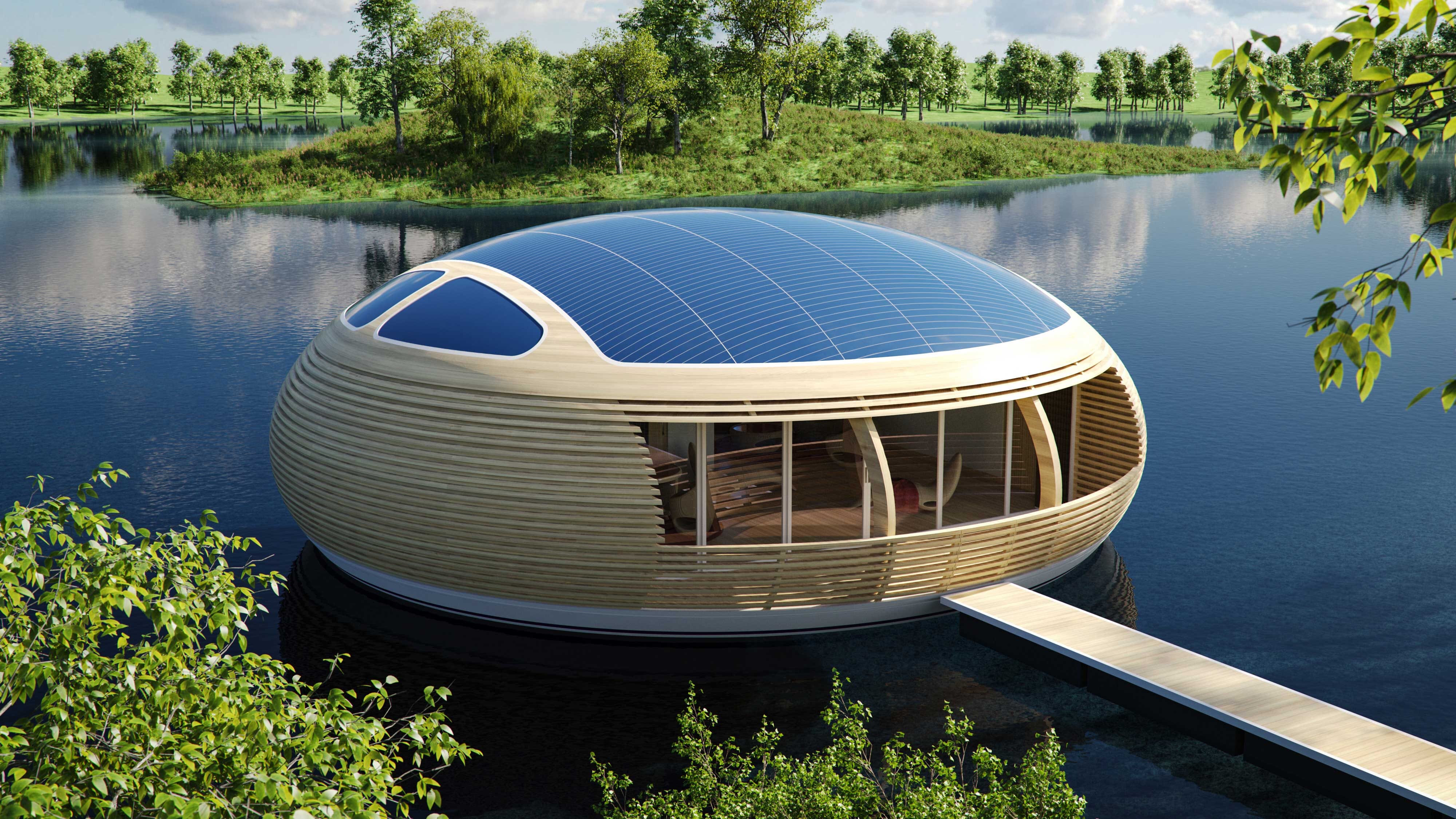
cover - scales the image to fill its container. The dimensions of the image may differ from the container size, if the image's aspect ratio does not match the aspect ratio of its container:
<div style="width:600px; height:200px">
<img data-src="https://demo.sirv.com/ecohome.jpg" class="Sirv image-fill" data-options="fit:cover">
</div>
crop - scales and crops the image from its center, to fill its container. The size of the delivered image will exactly match the size of the container.
<div style="width:600px; height:200px">
<img data-src="https://demo.sirv.com/ecohome.jpg" class="Sirv image-fill" data-options="fit:crop">
</div>
Right-click the images above and open them in a new tab to see their actual sizes. The cover image uses the original aspect ratio, with no cropping, with part of the image hidden; the crop image has been cropped by Sirv to the desired dimensions.
To display the images without stretching them, you should also add the following CSS styles to your page or external CSS file:
<style>
    img.Sirv {
        width: 100%;
        height: 100%;
    }
    img.Sirv.image-fit,
    img.Sirv.image-fill {
        width: 100%;
        height: 100%;
    }

    img.Sirv.image-fit {
        object-fit: contain;
    }

    img.Sirv.image-fill {
        object-fit: cover;
    }
</style>
Focal point crop
Sirv can automatically crop images around a particular point of interest, known as a focal point. This is perfect for serving cropped and scaled images to every device, without having to manually create different images for different size mobile and desktop screens.
Set the fit option to crop and the crop.type to focalpoint. Specify the location of your focal point from the top left of the image in px or % using cx and cy. Example:
<img class="Sirv image-fill" data-src="https://demo.sirv.com/bruna.jpg?crop.type=focalpoint&cx=825&cy=280" data-options="fit:crop">
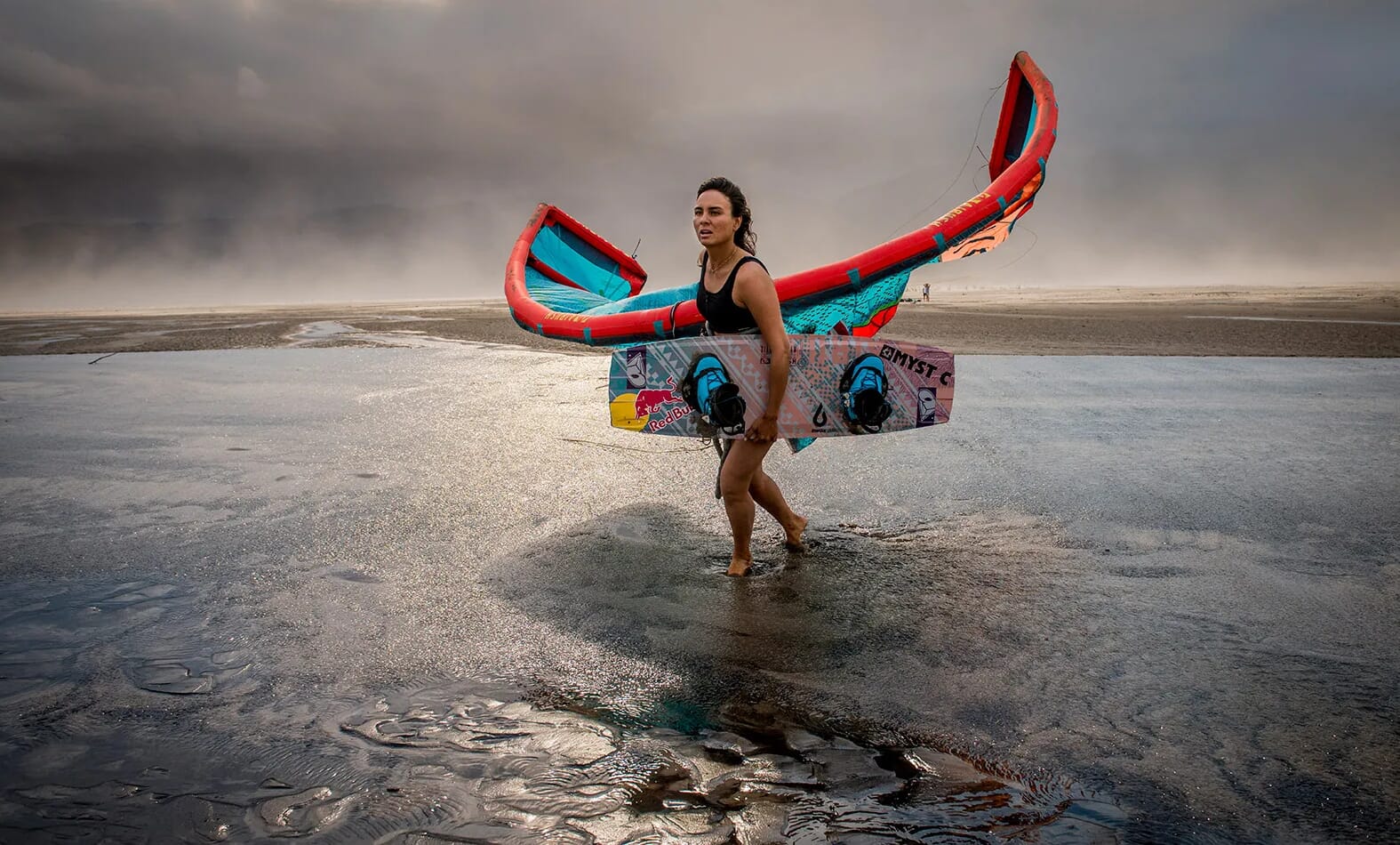
The aspect ratio of the original image is maintained by default. Alternatively, you can set width/height in a surrounding div. This example has 100% width and 250px height:
<div style="width:100%; height:250px">
<img class="Sirv image-fill" data-src="https://demo.sirv.com/bruna.jpg?crop.type=focalpoint&cx=825&cy=280" data-options="fit:crop">
</div>
Resize step
For better user experience, when a user resizes their browser, new images are only served if the difference in image size is at least 50px. This helps keep your page feeling fast.
The resize step can be increased to a higher value or reduced as low as 10px. To change the value, use the resizeStep option:
<img data-src="https://demo.sirv.com/Model-X.jpg" class="Sirv" data-options="resizeStep: 100;">
Image quality
Image quality is determined by your Default profile (80% by default). It can be overidden by applying a profile in the URL or appending the q parameter in the URL. The example below sets quality of 75%:
<img data-src="https://demo.sirv.com/Model-X.jpg?q=75" class="Sirv">
Sirv automatically serves retina images images to HiDPI devices, for beautifully sharp images. Retina images are typically 4 times larger in file size, so Sirv sets 60% quality by default, to help reduce data usage and loading time. Apply the hdQuality parameter to set a different retina quality. The example below sets standard res quality of 88% and retina quality of 82%:
<img data-src="https://demo.sirv.com/Model-X.jpg?q=88" class="Sirv" data-options="hdQuality:82">
Image processing
All of Sirv's dynamic imaging options can be applied to your responsive images, including watermarks, text overlays, crop, canvas, border, color and much more. This example adds a text overlay:
<img data-src="https://demo.sirv.com/Model-X.jpg?text.text=Model X&text.size=50&text.color=B70C15" class="Sirv">
Faster initialization
To load images faster, you can prefetch the DNS and pre-initiate the connection to Sirv resources. This best practice recommendation accelerates page loading and is automatically applied if you're using a Sirv plugin: Adobe Commerce CDN extension (formerly Magento), PrestaShop CDN addon and WordPress CDN plugin.
Paste the code below between the <head> and </head> of your HTML page:
<link rel="preconnect" href="https://scripts.sirv.com" crossorigin>
<link rel="preconnect" href="https://YOUR-SIRV-ACCOUNT.sirv.com" crossorigin>
<link rel="dns-prefetch" href="https://scripts.sirv.com">
<link rel="dns-prefetch" href="https://YOUR-SIRV-ACCOUNT.sirv.com">
In the above code, change YOUR-SIRV-ACCOUNT with your Sirv account name. The preconnect and prefetch code will connect to your Sirv direct domain, your Sirv CDN domain and the scripts needed for responsive imaging, Sirv Spin, Sirv Zoom and Sirv Media Viewer.
If you use a custom domain, reference that domain instead of your sirv.com domain:
<link rel="preconnect" href="https://YOUR-SIRV-CUSTOM-DOMAIN.com" crossorigin>
<link rel="dns-prefetch" href="https://YOUR-SIRV-CUSTOM-DOMAIN.com">
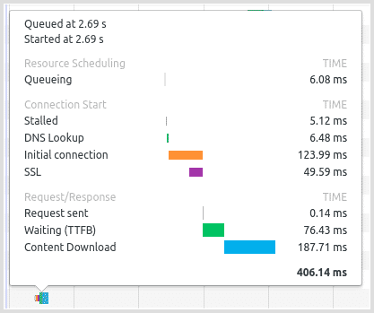
This technique typically loads files 100-300 ms sooner, for browsers that support preconnect. For browsers that only support DNS prefetch, it loads 10-150 ms sooner. You can measure the time taken for DNS lookup, initial connection and SSL handshake with your browser console. In Chrome, it looks like this:
Options
Table of options that can be applied via the 'data-options' tag:
| Parameter | Default | Description |
|---|---|---|
| hdQuality | 60 | Quality of HiDPI retina images (%) Possible values: 0-100 |
| resize | true | Enable responsiveness when page is resized Possible values: true / false |
| resizeStep | 50 | Width threshold to fetch new image when window resized Minimum 10px |
| lazy | true | Enable lazy loading of images as they come into view Possible values: true / false |
| threshold | 0 | Distance from viewport edge before lazy loading is triggered (px or %) |
| fit | contain | Hide or crop image if it is larger than the container Possible values: contain / cover / crop |
Options can alternatively be applied to all images on the page by using a script tag:
<script>
  var SirvOptions = {
    image: {
      hdQuality: 90
    }
  }
</script>
or like this:
<script>
  var SirvOptions = {};
  SirvOptions.image = {
      hdQuality: 90
  }
</script>
API
Responsive images will automatically initialize when the DOM is ready.
Alternatively, you can control images with these commands:
- Sirv.start() – starts all instances of .Sirv on the page.
- Sirv.stop() – stops all instances of .Sirv on the page.
To control a particular image on the page, specify its #id:
- Sirv.start(<#id>) – starts the .Sirv instance with a specific #id.
- Sirv.stop(<#id>) – stops the .Sirv instance with a specific #id.
For example, you can prevent automatic loading by setting "autostart" to false:
<script>
  var SirvOptions = {
    autostart: false
  }
</script>
Once the page has loaded, you can start Sirv on a specific element, such as this image:
<img data-src="https://demo.sirv.com/Model-X.jpg" class="Sirv" id="sirv-image">
Start it by #id:
<script>
  Sirv.start('sirv-image');
</script>
Start it by DOM Node:
<script>
  var sirvImage = document.querySelector('.Sirv');
  Sirv.start(sirvImage);
</script>
If you use Sirv Spin, refer to the wide range of Sirv Spin API methods.
Display a hidden image
If you place a lazy-loaded image in a hidden tab, div or other hidden block, it may not load when that tab/div is shown. That's because it inherits no width/height during page load.
To overcome this, while still benefitting from lazy loading, call window.dispatchEvent(new Event('resize')); once the hidden block becomes visible. It will trigger the "resize" event of the browser window, so sirv.js will recalculate the available width/height.