When to use image src, srcset or data-src
There are three ways to embed images in your web page: src, srcset or data-src.
The best way for a particular image depends on a few factors. This article will help you identify the best method for different scenarios.
Three embedding methods
The original method is src. It's best used with a scaled image, so add w or h, to serve an image of a certain width or height. This will serve a 300px wide image:
<img src="https://demo.sirv.com/lv.jpg?w=300">
A more advanced method is srcset, which contains images to suit different screen sizes. This will serve one of 4 images, depending on the width of your users' viewport:
<img
srcset="
 https://demo.sirv.com/lv.jpg?w=300   300w,
 https://demo.sirv.com/lv.jpg?w=600   600w,
 https://demo.sirv.com/lv.jpg?w=1200  1200w,
 https://demo.sirv.com/lv.jpg?w=2000  2000w"
sizes="70vmin">
The most advanced method is data-src with Sirv JS. It's also the easiest because images are scaled automatically:
<img data-src="https://demo.sirv.com/lv.jpg" class="Sirv">
This method requires your page to reference the Sirv JS script (refer to the documentation for responsive image scaling). Below is the full script (smaller scripts are also available):
<script src="https://scripts.sirv.com/sirvjs/v3/sirv.js"></script>
Benefits of each method
Sirv applies as many best-practices as possible when serving images. Some embed methods apply more best practices than others:
| src | srcset | data-src | |
|---|---|---|---|
| Next-gen format | Yes | Yes | Yes |
| Optimised | Yes | Yes | Yes |
| From Sirv CDN | Yes | Yes | Yes |
| Scaled with Sirv | Yes | Yes | Yes |
| Responsive | No | Partly | Yes |
| Lazy loaded | No | Partly | Yes |
| Automatic alt tag | No | No | Yes |
| Use without JS | Yes | Yes | No |
Which method to use
Best overall method is data-src
The best method is usually data-src because images are very responsive - a suitably scaled image will be served to every user, whatever their screen size. On page load, Sirv JS calculates the dimensions of the space around the image, then requests an image to suit the container, scaled up to the nearest 100px.
The image will be lazy loaded, so it won't load unless required. It will also inherit an alt tag automatically, if the image has a meta description in Sirv. If your images don't have descriptions yet, ask the Sirv team about our tool to automatically generate descriptions of your images using AI.
Another benefit of the data-src method is it's simple code - you just need to reference the master image, then Sirv JS will apply all the best practices.
However, your page must include the Sirv JS script and the script can only calculate the optimal image size once the DOMContentLoaded event fires (after the HTML has been parsed and deferred scripts have executed). Only then is the scaled image requested, so there will be a small loading delay for images at the top of the page.
If your page is well optimized, the DOMContentLoaded event should fire quickly and these images will still load quickly. But if your page is not well optimized, you can add src. The src image will be requested straight away on DOMContentLoaded, loading very quickly and acting as a temporary placeholder image for 1-2 seconds, until the perfectly sized data-src image loads.
The placeholder will be shown for such a short time that you could heavily compress it, so the file size is very small. This example sets a 400px width placeholder with quality of 30%:
<img src="https://demo.sirv.com/lv.jpg?w=400&q=30" data-src="https://demo.sirv.com/lv.jpg" class="Sirv">
Fastest responsive method is srcset
An alternative for a very fast loading responsive image is to use srcset. It's more effort to configure because you'll need to specify all the different screen sizes that you're targeting. It's also only "semi-responsive" because it's limited to the sizes you specify. However, it won't need Sirv JS or a placeholder, so it'll load very quickly.
Best method for SVG is src
The classic src is the original way to embed an image. It will return only 1 image, so it is not responsive. It won't be requested by Sirv JS, so won't have automatic lazy loading or automatic alt tags. But it is perfect for embedding SVG images. SVG is a vector graphics format, so only 1 file is needed - it will automatically scale to the perfect size to suit every device. Sirv optimizes SVG images, to reduce file size and help them load fast.
<img src="https://demo.sirv.com/shield.svg">
Use lazy loading, where appropriate
Sirv JS will apply lazy loading on all browsers automatically. If the image is above the fold, you can disable lazy-loading by setting data-options="autostart:created". Example:
<img class="Sirv" data-src="https://demo.sirv.com/tomatoes-basil.jpg" data-options="autostart:created">
If you're not using Sirv JS, then you should add the loading="lazy" attribute to the image, if it is below the fold.
<img srcset="https://demo.sirv.com/lv.jpg?w=300 300w, https://demo.sirv.com/lv.jpg?w=600 600w, https://demo.sirv.com/lv.jpg?w=1200 1200w, https://demo.sirv.com/lv.jpg?w=2000 2000w" sizes="70vmin" loading="lazy">
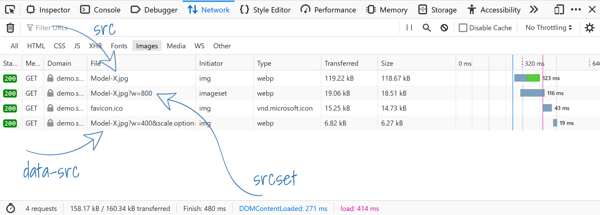
Loading time comparison
You can use your browser console to check the loading time of your images.
A test page showing different ways to embed images shows the file size, time until request and time to download the image.
Help from a Sirv expert
If you'd like help from the Sirv team, please submit a message and we'll reply within 24 hours.