Images
Responsive, lazy loading images
Sirv JS is a powerful tool for serving the most optimal images to your website.
Web development best practices recommend serving scaled and lazy loaded images. That means each image should be scaled to the appropriate size for each visitor (not scaled in the browser) and loaded only if required (lazily). Sirv automatically performs both dynamic resizing and lazy loading.
Example
The following image is automatically scaled to fit the viewport. It loads lazily, on-demand:
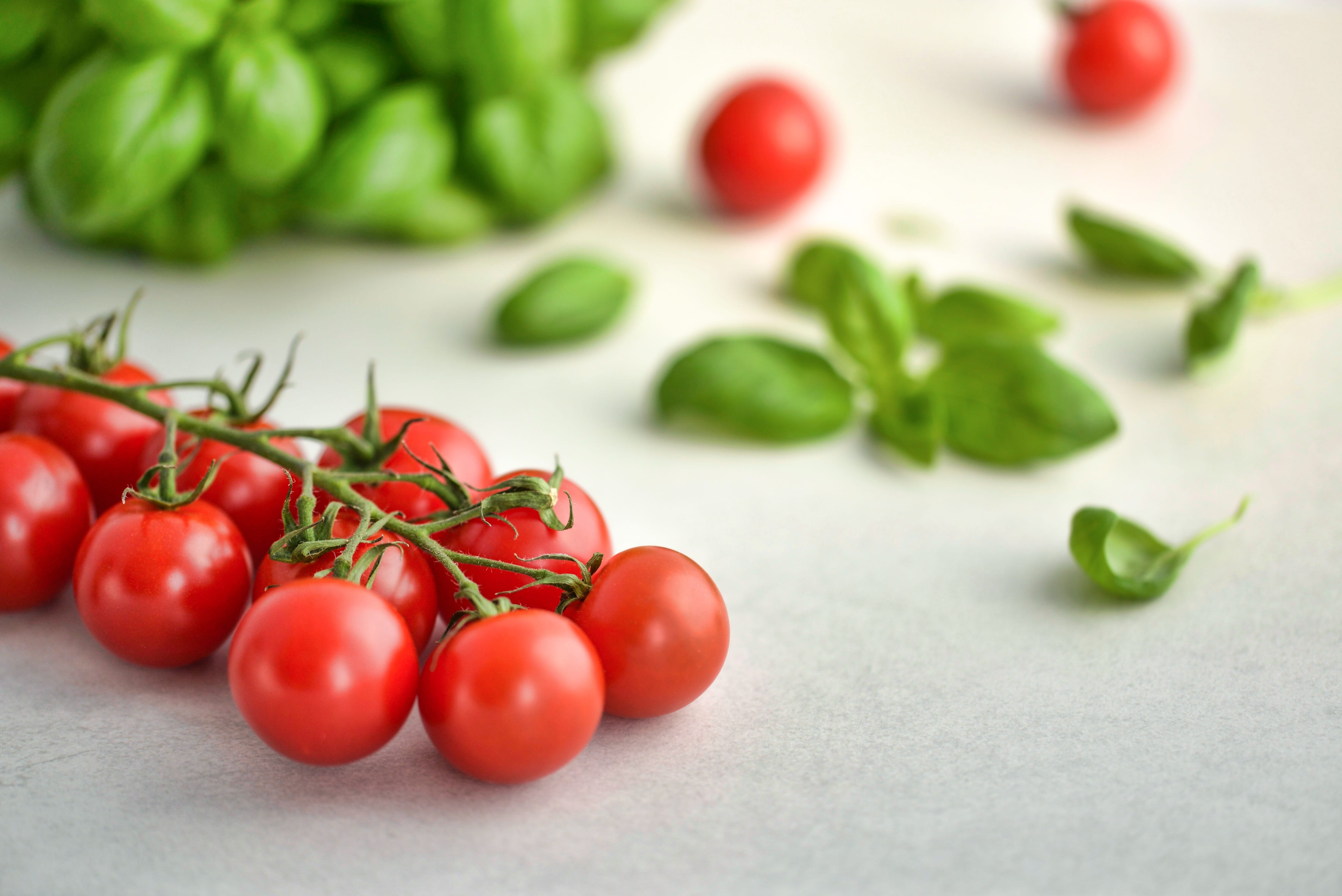
This is achieved by giving the img a class and data-src like so:
<img class="Sirv" data-src="https://demo.sirv.com/tomatoes-basil.jpg">
Add Sirv JS to your page, preferably as early as possible in your code, before any other scripts:
<script src="https://scripts.sirv.com/sirvjs/v3/sirv.js"></script>
If you only need Sirv JS for images, you can use a smaller version of Sirv JS instead.
Options
You can control when and how images load:
| Parameter | Default | Options | Description |
|---|---|---|---|
| autostart | visible | created, visible, off | Automatically initiate the image viewer (lazy loading). |
| threshold | 0 | number (px) | Distance from viewport before loading is triggered. |
| quality | 80 | 0-100 (%) | Quality of standard images. |
| hdQuality | 60 | 0-100 (%) | Quality of hi-res images (retina). |
| fit | contain | contain, cover, crop | Method to scale/crop image to fit area. |
| resize | true | true, false | Load resized image if viewport changes size. |
How to apply options
Options can be applied either inline to an img using data-options or globally to all instances on the page with a script using the variable SirvOptions (or SirvMobileOptions for mobile devices).
Inline and script examples are provided below. Only one of the approaches is needed. If both approaches are used, the inline option will take precedence.
Autostart & lazy loading
autostart defines when content starts loading. There are 3 possible values:
- created - load immediately (as soon as img src has been created).
- visible - lazy load image once it enters the viewport.
- off - not loaded (you can load the image with the API).
Lazy loading is applied by default, when the image becomes visible in the viewport. Instead, you can choose created to disable lazy loading and load the image as soon as sirv.js has calculated the most optimally sized image, like so:
<img class="Sirv" data-src="https://demo.sirv.com/tomatoes-basil.jpg" data-options="autostart:created">
<script>
var SirvOptions = {
  lazyImage: {
    autostart: 'created'
  }
}
</script>
Threshold
threshold can prevent delays when loading a lazy load. By default, as a user scrolls down your page, an image will lazy load once it enters the viewport (i.e. the visible part of the page). Instead, you can commence lazy loading once the user is within a certain distance of the viewport.
This example will load the image once it's within 200px of the viewport:
<img class="Sirv" data-src="https://demo.sirv.com/tomatoes-basil.jpg" data-options="threshold:200">
<script>
var SirvOptions = {
  lazyImage: {
    threshold: 200
  }
}
</script>
Quality
The following image quality defaults are applied to JPEG/WebP images:
- Standard images: 80%
- Hi-res images: 60% (retina screens)
Change image quality with the quality and hdQuality parameters.
For example, raise the quality to 90% and 80% like so:
<img class="Sirv" data-src="https://demo.sirv.com/tomatoes-basil.jpg" data-options="quality:90;hdQuality:80">
<script>
var SirvOptions = {
  lazyImage: {
    quality: 90,
    hdQuality: 80,
  }
}
</script>
<img data-src="https://demo.sirv.com/salad.jpg?q=85" class="Sirv">
If the q parameter is in the URL and its value is lower than the hdQuality setting, the URL parameter will supersede the hdQuality setting.
Retina delivery
Retina (HD) quality is applied if:
- Device pixel ratio (DPR) >= 1.5
- Image can be loaded at >=1.5x size of its viewport size
Retina images are always served to HD screens, this cannot be disabled.
Fit
fit lets you crop an image as well as resize it.
The examples below show a large image (4516 x 3015 px) placed in a 600 x 200 px div.
Set it to contain to scale the image to fit its container, without any cropping (the default behaviour):
<img class="Sirv" data-src="https://demo.sirv.com/tomatoes-basil.jpg" data-options="fit:contain">
<script>
var SirvOptions = {
  lazyImage: {
    fit: 'contain'
  }
}
</script>
Set it to cover to scale the image to fill its container. The dimensions of the image may differ from the container size, if the image's aspect ratio does not match the aspect ratio of its container:
<img data-src="https://demo.sirv.com/tomatoes-basil.jpg" class="Sirv image-fill" data-options="fit:cover">
<script>
var SirvOptions = {
  lazyImage: {
    fit: 'cover'
  }
}
</script>
Set it to crop to scale and crop the image from its center, to fill its container. The size of the delivered image will exactly match the size of the container.
<img data-src="https://demo.sirv.com/tomatoes-basil.jpg" class="Sirv image-fill" data-options="fit:crop">
<script>
var SirvOptions = {
  lazyImage: {
    fit: 'crop'
  }
}
</script>
The last 2 images above look the same but are different. Open them in a new tab and you'll see that cover uses the original aspect ratio while crop has been cropped to the desired dimensions.
If only height is being inherited from the surrounding HTML/CSS, then to get the most ideally scaled image, you should add this CSS:
.image-container img.Sirv {
  /* explicitly set image height to match the container */
  height: 100%;
  /* fit image into container preserving its aspect ratio */
  object-fit: contain;
}
Resize
The resize parameter fetches a freshly scaled image if the viewport is resized. This could happen when rotating from portrait to landscape on a mobile - the viewport will become much wider, so Sirv will load a larger version of the image.
If you'd like to disable this, set resize to false:
<img class="Sirv" data-src="https://demo.sirv.com/tomatoes-basil.jpg" data-options="resize:false">
<script>
var SirvOptions = {
  lazyImage: {
    resize: false
  }
}
</script>
Fullscreen
You can make the image expand to fullscreen on click, with the fullscreen.always parameter (one Sirv Media Viewer's global options). Instead of an img tag, use a div tag and apply your settings in data-options, for example:
<div data-src="https://demo.sirv.com/salad.jpg" data-options="fullscreen.always:true" class="Sirv"></div>
<script>
var SirvOptions = {
  viewer: {
    fullscreen: {
      always: true
    }
  }
}
</script>
Mobile options
You can set different options for mobile devices with SirvMobileOptions. The example below sets different image quality on desktop and mobile devices:
<script>
var SirvOptions = {
  viewer: {
    quality: 85,
    hdQuality: 75
  }
}
var SirvMobileOptions = {
  viewer: {
    quality: 70,
    hdQuality: 55
  }
}
</script>
Lazy loading background images
You can also apply responsive scaling and lazy loading to background images:
1. Create a div with a class of Sirv (note it should not be an img).
2. Provide the image URL in the data-bg-src attribute.
Example:
<div data-bg-src="https://demo.sirv.com/image.jpg" class="Sirv"></div>
If you'd like your background image to fill the background on mobile, add data-mobile-options="fit: cover" or data-mobile-options="fit: crop".
Example:
<div data-bg-src="https://demo.sirv.com/image.jpg" data-mobile-options="fit: cover" class="Sirv"></div>
Lazy loading external assets
Sirv JS can lazy load assets that are not hosted on Sirv. If you do this, apply the attribute data-type="static" so that it bypasses dynamic scaling, to load the asset sooner. For example:
<img data-src="https://www.a-website.com/image.jpg" class="Sirv" data-type="static">
Custom 404
If an image is missing, a 404 error is returned. You can customize this to serve an image of your choice.
Set a custom error message in your Default profile or set a custom error message to a specific set of images via another profile. Go to your Profiles page to choose the profile, click Edit and in General Settings enter the path to your image in the "Default image" field.
Example custom image, shown instead of an empty 404 error:

Add height to prevent CLS
If your content jumps during image loading, that is known as CLS (Cumulative Layout Shift). To prevent this, you can either add height to the container around your image or you can add height (and width) to your images. Simply add height and width parameters, for example:
<img data-src="https://demo.sirv.com/example.jpg" class="Sirv" height="413" width="620">
Use placeholder for faster experience
Consider adding a placeholder image for the fastest loading experience. The placeholder will be requested via src immediately during page load. Shortly afterwards, once sirv.js has loaded, the data-src image will load in the most optimal dimensions, replacing the placeholder image.
This technique will also improve your PageSpeed score.
Benefits include:
- Faster appearance of images above the fold
- Reduced Total Blocking Time (in combination with Sirv.js async loading)
- Faster Time to Interactive
- Better timing for Largest Contentful Paint
- Better score for Cumulative Layout Shift (if aspect-ratio or width/height applied)
Image placeholder
To use a placeholder, add a src attribute to the image. The image URL should be scaled and with low quality because it will be displayed so briefly. You can also add loading="lazy", to prevent the image from being requested if it is below the fold.
The following example will request a 400px width image ?w=400 with 10% quality &q=30. It also applies an optional aspect-ratio of 6/4, so the placeholder fills the area, preventing cumulative layout shift:
<img
    src="https://demo.sirv.com/example.jpg?w=400&q=10"
    data-src="https://demo.sirv.com/example.jpg"
    loading="lazy"
    class="Sirv"
    style="aspect-ratio:6/4"
>
This placeholder technique means that there's an extra image request during load but it is recommended because the user gets a fast experience, whilst also receiving the most optimally scaled image for their device - the best of both worlds.
Solid placeholder
For even faster placeholder loading, you could show an inline SVG, optionally with base64 encoding. This approach won't show the actual image but it does suggest to the user that the image is coming and it avoids having that one extra image request.
This example will load a solid grey SVG converted to base64:
<img
    src="data:image/svg+xml;base64, PHN2ZyB4bWxucz0iaHR0cDovL3d3dy53My5vcmcvMjAwMC9zdmciIHZpZXdCb3g9IjAgMCAzMDAgMzAwIiBzdHlsZT0iYmFja2dyb3VuZC1jb2xvcjojY2JjYmNiIi8+Cg=="
    data-src="https://demo.sirv.com/example.jpg"
    class="Sirv"
>
This example will load an animated grey SVG converted to base64:
<img
    src="data:image/svg+xml;base64, PHN2ZyBpZD0iZUhvdk1wRWo0VDIxIiB4bWxucz0iaHR0cDovL3d3dy53My5vcmcvMjAwMC9zdmciIHhtbG5zOnhsaW5rPSJodHRwOi8vd3d3LnczLm9yZy8xOTk5L3hsaW5rIiB2aWV3Qm94PSIwIDAgMTAwJSAxMDAlIiBzaGFwZS1yZW5kZXJpbmc9Imdlb21ldHJpY1ByZWNpc2lvbiIgdGV4dC1yZW5kZXJpbmc9Imdlb21ldHJpY1ByZWNpc2lvbiIgc3R5bGU9ImJhY2tncm91bmQtY29sb3I6I2Y1ZjVmNSI+DQo8c3R5bGU+PCFbQ0RBVEFbDQojZUhvdk1wRWo0VDIyX3RvIHthbmltYXRpb246IGVIb3ZNcEVqNFQyMl90b19fdG8gMTYwMG1zIGxpbmVhciBpbmZpbml0ZSBub3JtYWwgZm9yd2FyZHN9QGtleWZyYW1lcyBlSG92TXBFajRUMjJfdG9fX3RvIHsgMCUge3RyYW5zZm9ybTogdHJhbnNsYXRlKC0yMDAwcHgsNTAwcHgpfSA1MCUge3RyYW5zZm9ybTogdHJhbnNsYXRlKDUwMHB4LDUwMHB4KX0gMTAwJSB7dHJhbnNmb3JtOiB0cmFuc2xhdGUoMjAwMHB4LDUwMHB4KX19DQpdXT48L3N0eWxlPg0KPGRlZnM+PGxpbmVhckdyYWRpZW50IGlkPSJlSG92TXBFajRUMjItZmlsbCIgeDE9IjAiIHkxPSIwLjUiIHgyPSIxIiB5Mj0iMC41IiBzcHJlYWRNZXRob2Q9InBhZCIgZ3JhZGllbnRVbml0cz0ib2JqZWN0Qm91bmRpbmdCb3giIGdyYWRpZW50VHJhbnNmb3JtPSJ0cmFuc2xhdGUoMCAwKSI+PHN0b3AgaWQ9ImVIb3ZNcEVqNFQyMi1maWxsLTAiIG9mZnNldD0iMCUiIHN0b3AtY29sb3I9InJnYmEoMTc4LDE4OCwxOTQsMCkiLz48c3RvcCBpZD0iZUhvdk1wRWo0VDIyLWZpbGwtMSIgb2Zmc2V0PSIyMCUiIHN0b3AtY29sb3I9InJnYmEoMTc4LDE4OCwxOTQsMC4yKSIvPjxzdG9wIGlkPSJlSG92TXBFajRUMjItZmlsbC0yIiBvZmZzZXQ9IjUwJSIgc3RvcC1jb2xvcj0icmdiYSgxNzgsMTg4LDE5NCwwLjQpIi8+PHN0b3AgaWQ9ImVIb3ZNcEVqNFQyMi1maWxsLTMiIG9mZnNldD0iODAlIiBzdG9wLWNvbG9yPSJyZ2JhKDE3OCwxODgsMTk0LDAuMikiLz48c3RvcCBpZD0iZUhvdk1wRWo0VDIyLWZpbGwtNCIgb2Zmc2V0PSIxMDAlIiBzdG9wLWNvbG9yPSJyZ2JhKDE3OCwxODgsMTk0LDApIi8+PC9saW5lYXJHcmFkaWVudD48L2RlZnM+PGcgaWQ9ImVIb3ZNcEVqNFQyMl90byIgdHJhbnNmb3JtPSJ0cmFuc2xhdGUoLTUwMCw1MDApIj48cmVjdCB3aWR0aD0iMTAwJSIgaGVpZ2h0PSIxMDAlIiByeD0iMCIgcnk9IjAiIHRyYW5zZm9ybT0idHJhbnNsYXRlKC01MDAsLTUwMCkiIG9wYWNpdHk9IjAuOCIgZmlsbD0idXJsKCNlSG92TXBFajRUMjItZmlsbCkiIHN0cm9rZS13aWR0aD0iMCIvPjwvZz48L3N2Zz4NCg=="
    data-src="https://demo.sirv.com/example.jpg"
    class="Sirv"
>
Blurred image placeholder
Instead of serving a low quality image, a popular effect is to show a blurred image. The image file size will be smaller and it will be very obvious that it is just a temporary placeholder. This example has a width of only 40px and quality of 10%:
<img
    src="https://demo.sirv.com/example.jpg?w=40&q=10"
    data-src="https://demo.sirv.com/example.jpg"
    loading="lazy"
    class="Sirv"
>
Defer or async Sirv JS
Sirv JS requests images once the DOMContentLoaded event has fired. This event does not wait for stylesheets to load, so if your stylesheet changes the dimensions of the image container, then the page might receive an image of non-optimal dimensions.
To solve this, delay the image request until the CSS has been parsed, by adding defer to the JS:
<script src="https://scripts.sirv.com/sirvjs/v3/sirv.js" defer></script>
Alternatively, you can load Sirv JS asynchronously to remove it from render-blocking resources. Add the async attribute and this will reduce Total Blocking Time in your PageSpeed report:
<script src="https://scripts.sirv.com/sirvjs/v3/sirv.js" async></script>
Alt text on images
Sirv JS automatically adds alt text to your images, if a meta description exists. Learn how to apply alt text to your images.
FAQ
Sirv JS is designed to lazy-load and perfectly scale your optimized images. The Cloudflare Rocket Loader script (rocket-loader.min.js) can't scale but can lazy-load images, which can clash with Sirv JS, preventing image loading. If you observe this, test your page with either script enabled and decide which to disable.
If your image appears blurry, it might be being scaled up in the browser. This can happen if your CSS overrides Sirv's CSS or if changes to the DOM cause the image container to change size/proportion after the Sirv image has loaded.
The solution depends on the exact cause. The most correct solution is to change your CSS/HTML to prevent style overriding and changing the aspect ratio of the image container. Other solutions may be to submit an image.resize() API callback after 16-64 milliseconds. Or set the fit parameter to fit:cover if the image should cover the container. Or add an image placeholder.