9 Tips to Increase Your Shopify Sales (With App Recommendations)

In 2020, e‐commerce has become more important than ever; thousands of businesses had to transition to selling online simply to survive. The platform that embraced most of them was Shopify.
Shopify’s popularity is no surprise. Building your own, scalable, online store with hundreds of built-in features is a breeze with Shopify. The only thing that Shopify isn’t good at is making your products sell themselves. The competition is more fierce than ever, that’s why it’s important to know which tactics for increasing your Shopify sales are worth your time.
In this blog post, Sirv and Snap36 – leaders in image hosting and product photography respectively – have teamed up to provide you with the best tips and tricks for raising your online sales using Shopify.
9 Proven Ways to Increase Your Shopify Sales
- Always be A/B testing
- Have a clear call-to-action
- Provide great product detail page UX
- Go beyond product images: 360 spins and videos
- Increase average order value: upsells and cross-sells
- Do SEO (search engine optimization)
- Focus on email marketing
- Utilize social proof
- Reduce friction at checkout
Want to read this post later? Enter your email below and we’ll send you a PDF.
Start with Measurable Goals
Before we get started, it’s important to have a plan in place to determine what your goals are. You can’t manage what you can’t measure, and your goals should be actionable and measurable.
Shopify Analytics is fine for tracking sales and inventory, but attribution is its weak point. This might not seem like a big deal at first, but when you start running marketing campaigns, you really need to get your attribution right, or else you’ll waste your ad budget… We recommend using an external analytics service, like Google Analytics.
Use this guide on Google Analytics installation, and the official Shopify documentation to set up your analytics.
Tip 1: Always be A/B Testing

After you have your analytics sorted out, you can track what’s working to increase your Shopify sales.
But here’s the catch: it’s not as easy as it may seem to track the impact of changes made to your Shopify store on your sales numbers.
Some time frames can be busier than others – a change you’ve made could coincide with a new marketing campaign, bringing in some quality high converting traffic, or on the contrary, one of your products could hit the front page of Reddit and lead thousands of visitors which aren’t really interested in buying to your store.
In all of these cases, it’s scientifically impossible to determine what caused an increase or decrease in conversions. That’s when A/B testing comes in – it’s a scientifically correct way to test the impact of your changes on your conversion rate.
How does A/B testing Work?
A/B testing is an experiment where two variations of your page(s) are shown to users at random, then the best performing page version is chosen based on your goal conversion rate and statistical significance.
Does Shopify offer native A/B testing?
No, Shopify does not provide built‐in tools for A/B testing, so you’ll have to rely on an external service.
What A/B testing tool to choose for Shopify?
- Google Optimize – It’s an A/B testing platform from Google with great Google Analytics integration and easy to use interface. To learn how to set it up with Shopify, refer to this guide.
- VWO – Visual Website Optimizer is another easy to use tool for running A/B tests on Shopify. Here’s how to integrate VWO with Shopify.
For more in-depth A/B testing advice, Shopify wrote a great article here.
If you’re looking for A/B testing ideas, Sumo have compiled a nice list.
Tip 2: Have a Clear Call to Action
What is a call to action?
A call to action (CTA) is a link or a button that signals the most-desired action to your site visitors. This action will vary from page to page, and different CTAs will serve different functions throughout the customer journey:
Let’s take a look at a typical buyers journey on Bremont’s Shopify store:
Navigate the screenshots above with arrows
Bremont’s CTAs are clear and straightforward.
Here are some tips for creating CTAs you can’t help but click:
Place your main CTA above the fold
‘Above the fold’ is the part of the page that is immediately visible to your users. Here’s a typical fold:
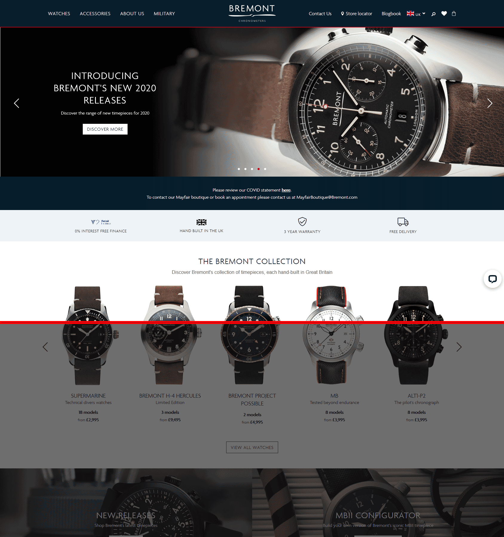
A typical fold on a Full HD screen
Recent studies show that users spend 57% of their time viewing content above the fold. Naturally, to ensure your main CTA gets noticed, put it above the fold. Don’t forget to test on mobile devices.
Create urgency
Experiment with your call to actions by supplementing them with items that add urgency, like:
- Low stock warnings
- Today only deals
- Current viewers and recent purchases
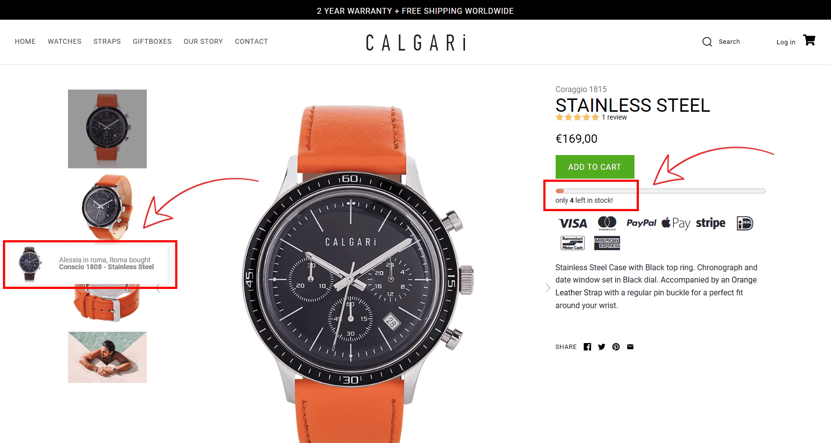
See what Calgari watches did there?
Use an app like Urgency Bear to achieve a similar effect.
Use simple and proven phrases
Try to stick to battle-tested and familiar phrases.
Some of the most common e-commerce CTAs include this copy:
- Homepage: Shop now, Shop the collection
- Collection/category page: Buy now, Buy now with 1-Click
- Product page: Add to Cart/Bag, Buy now
- Cart: Checkout
- Checkout: Pay now
Test CTA design and colors
So, you have your important CTAs placed above the fold, the copy is impeccably engaging, but your conversion rate is still low. What gives? You might want to look into your CTA design. If your CTA’s contrast is bad, or if it’s too small – people will just miss it, or get distracted by other elements on your page.
Make sure to:
- Use contrasting colors. There’s plenty of tools that can help you with choosing colors.
- Use readable fonts. Avoid fancy ones, readability is key.
- Size matters. Don’t sacrifice your CTA’s size in favor of other elements on the page.
This ‘Add to bag’ CTA ticks all the boxes: it’s readable, has great contrast with the page background, and is big enough to be noticed by anyone.
Place important information near the CTA on product pages
- Price (including any discounts)
- Availability
- Delivery Policy
- Aggregate Reviews
- Color, size, and quantity options.
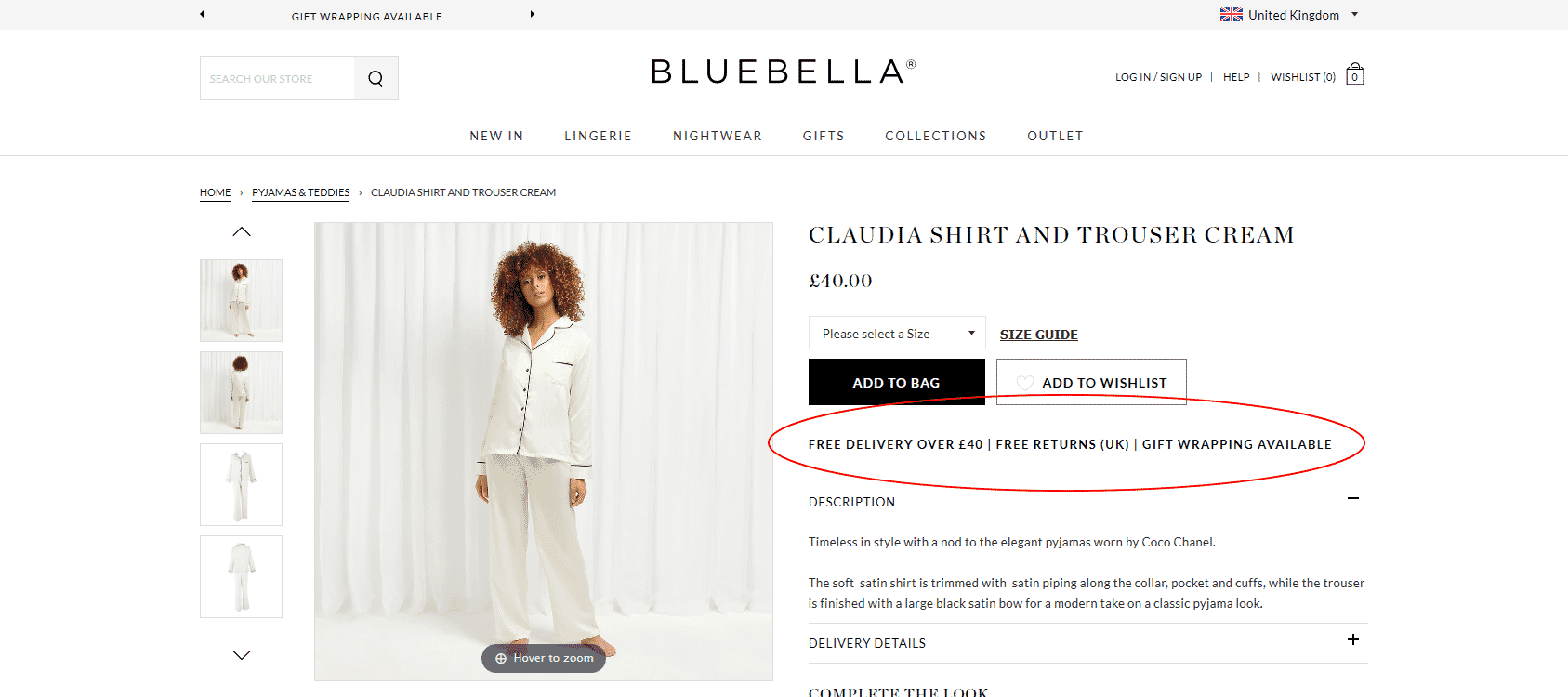
Bluebella get it right with delivery, returns, and gift wrapping information being clearly visible.
Tip 3: Provide Great Product Detail Page UX
Shopify has very well optimized cart and checkout pages. There’s a lot more freedom in customizing the product detail page (PDP) design. A high converting product detail page design is critical for a successful Shopify store. PDPs can make or break a sale.
Here are some crucial elements you need on a product detail page:
- Use Recognizable image(s). Images are the focal point of all product detail pages. Make sure to include high resolution, zoomable product photos. Having at least one in-scale image can be important for some products.
- Add Image Zoom. After the global e-commerce shift to mobile, product images have to be zoomable. Here’s one of the top-rated Shopify image zoom apps.
- Implement 360-degree spins. This technique has been found very effective for increasing conversion rates and decreasing returns. This is even more important in COVID-19 times. Here’s how to add add a 360-degree product view to Shopify.
- Write concise product descriptions to communicate information that can’t be answered by product images or 360-degree spins. Get straight to the point.
- Price. Be honest and transparent. Surprise fees in the later stages of the customer journey can result in lost sales.
- Product availability. Users can get frustrated if you don’t communicate clearly the stock status of your products. Out of stock? Allow users to add the item to cart, but clearly communicate that shipping will be delayed. Alternatively, set up restock notifications.
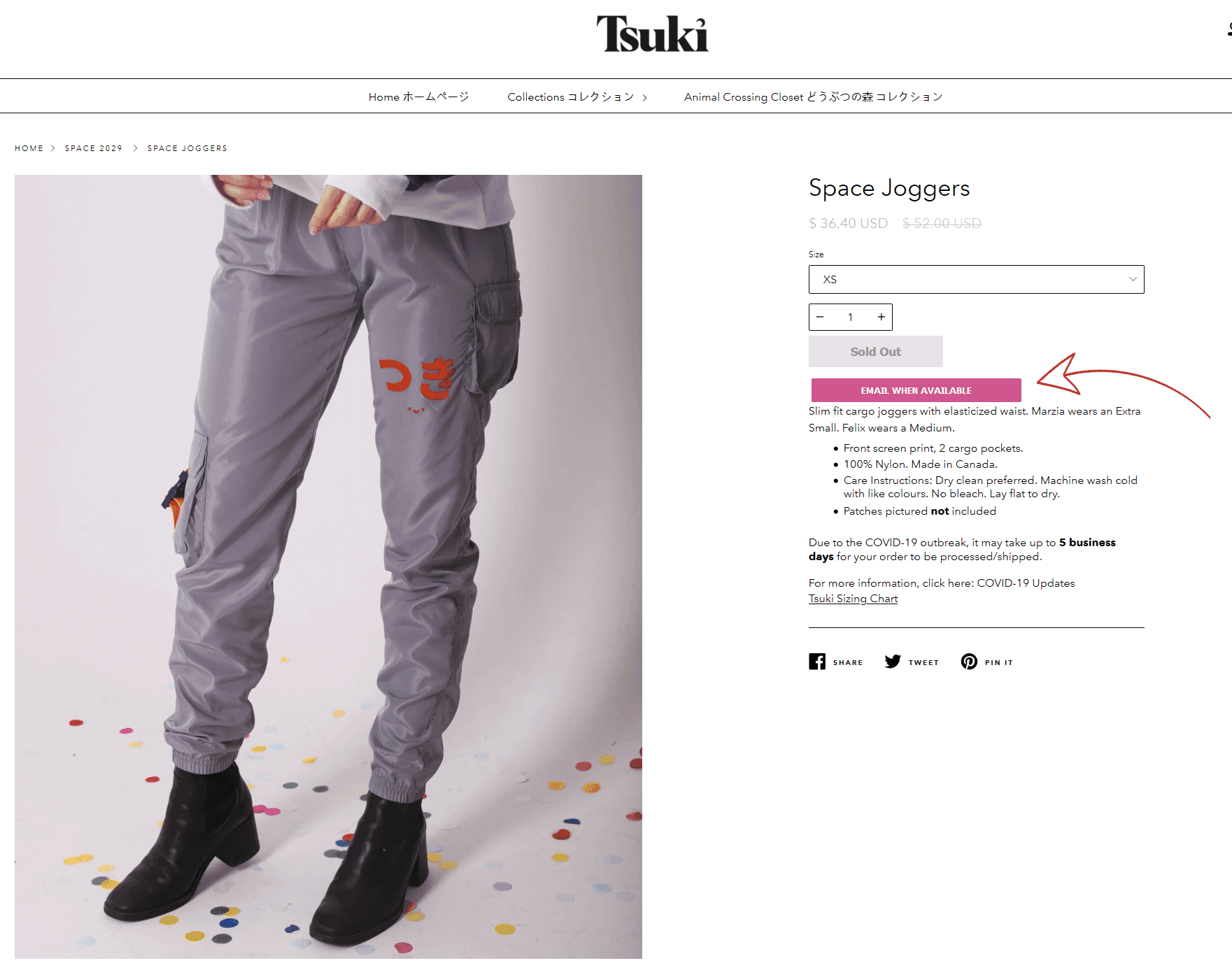
Tsuki sell out very quickly. Email reminders when products are back in stock make a lot of sense in their case.
- Make the Add to cart process noticeable with visual feedback. Make it obvious that the item has been added to the cart. Harry’s does a really good job:
- Product options. Especially important if items can’t be added to the cart without a variation being chosen. Make sure to make other important elements related to your variations like pricing and availability clear too.
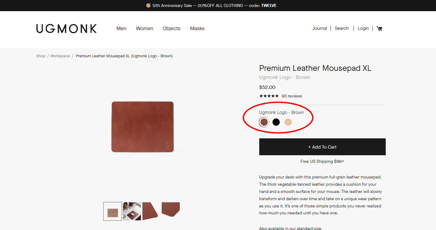
- Shipping policy. Lack of this information on the product page could be enough for some users to turn to your competitors. Be sure to list your shipping conditions on the product page. If your shipping is complex, consider adding a link to a shipping calculator.
- Add a Wishlist. Wishlists help increase engagement and retention, it’s important to capture customer’s info to help close the sale by asking them to sign up. Adidas’ wishlist is very well executed: unobtrusive design, actionable copy and a discount offer
- Optimize product reviews. Reviews should be filterable or sortable by rating, ideally with a rating distribution summary. Apps like Yotpo can help improve the customer review experience.
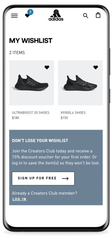
You can replicate this in Shopify with this app.
Tip 4: Go Beyond Product Images: 360 Spins and Videos
The product gallery is the most important source of information in your Shopify store. A lot of customers make a buying decision based on product imagery alone.
During the COVID-19 pandemic, many people who didn’t shop online have now started doing so. A common concern among this group (and most online shoppers) is product returns. Simple product images might not be enough in this day and age.
Increase Shopify sales with 360-degree spins
360-degree Images are interactive experiences that allow buyers to rotate your product around and even up and over to mimic what they would do in a store. 360° imagery gives people the opportunity to fully explore a product and reduce or even eliminate any doubt they have selected the right item.
Here’s how it looks:
Here’s what actual Shopify store owners have to say about 360 spins:
Q: Have your sales increased since you added 360 spins?
A: We have definitely seen our sales increase as a result. Customers are spending significantly more time on the page & are able to see the product from all angles. It allows them to access high-ticket products on their computer screen and see all the necessary ins & outs before making a purchase without ever having to come into a brick & mortar store. It’s great!
Q: Have you noticed a decline in order returns (unwanted cancellations)?
A: Yes – absolutely. As customers now know all the intricacies from top to bottom of our mobility scooters & electric wheelchairs. There are no surprises like we had before when customers weren’t able to view the product in 360 degrees. They can do this from the comfort of their home and it helps our business so much!
Q: Have you noticed any other benefits since adding 360 spins of your products?
A: Customers are able to see a more detailed view of each armrest, footrest, how the chair looks, where the battery goes etc so when the product arrives at their door, they are already intimately familiar with the different features and functions of their mobility equipment. We value the technology so much!
Q: How do products that have 360 spins perform compared to products that don’t?
A: Definitely better because the customer has access to an in-depth picture of what the mobility scooter or electric wheelchair will look like prior to it arriving to their home. It makes it much easier to purchase online than ever before & we are very grateful for that.
Scott Zabriskie, Scooters ‘N Chairs
High-ticket product merchants aren’t the only ones who can benefit from 360 spins:
“…360 spin technology helped us get a partnership with Goldbelly.com and a story in the Washington Post. Not only that, it adds to our credibility as a brand instantly. Our sales tripled after implementing the technology….”
Robin Davis, Big Shake’s Hot Chicken
How to add 360 spins (360-degree product views) to Shopify?
Easily add 360 spins to your Shopify store by following these instructions.
No Sirv account yet? Create gorgeous 360 degree spins in minutes. Sign up now and get 5 GB for 30 days for free.
Product videos
There’s no single formula for a product video that works for every Shopify store. Customers’ expectations differ greatly depending on the products you sell.
Here are some types of product videos that can help increase sales on your Shopify store:
- Lifestyle videos should put your product in context, showing the product in use or why it’s valuable.
- Storytelling videos can work wonders for luxurious or innovative products.
- Explainer videos work great for more complex products that require “how-to” explanations of a function or even installation.
- Testimonial videos can maximize social proof. Entire brands have been built on celebrity endorsements alone.
- 360-degree spin videos work great on alternative sales channels (where you can’t use an interactive 360 spin). If you’re utilizing other Shopify sales channels like Amazon, Facebook, or Instagram, 360-degree spin videos can be very compelling to your customers. You can convert 360 spins to videos in seconds with Sirv.
How to add product videos to Shopify?
You can easily add videos to your Shopify store with the Magic Zoom Plus app.
Tip 5: Increase Average Order Value. Upsells and Cross-sells
Upselling and cross-selling is both the art and science of introducing customers to better or complementary products based on what they are currently interested in.
Well-executed upselling and cross-selling can boost revenue by increasing average order value. Additionally, your customer benefits by making sure they are choosing the right product for them and that they have everything they need to use that product. This is where personalization is important. You want to make sure your upsells and cross-sells are customized and relevant to that shopper. Always consider the experience from a customer’s perspective.
For example, you can engage customers by showing a message which indicates “people who bought this, also bought this”. You can play around with wording to match your store, here’s how Vici Collection handles this:
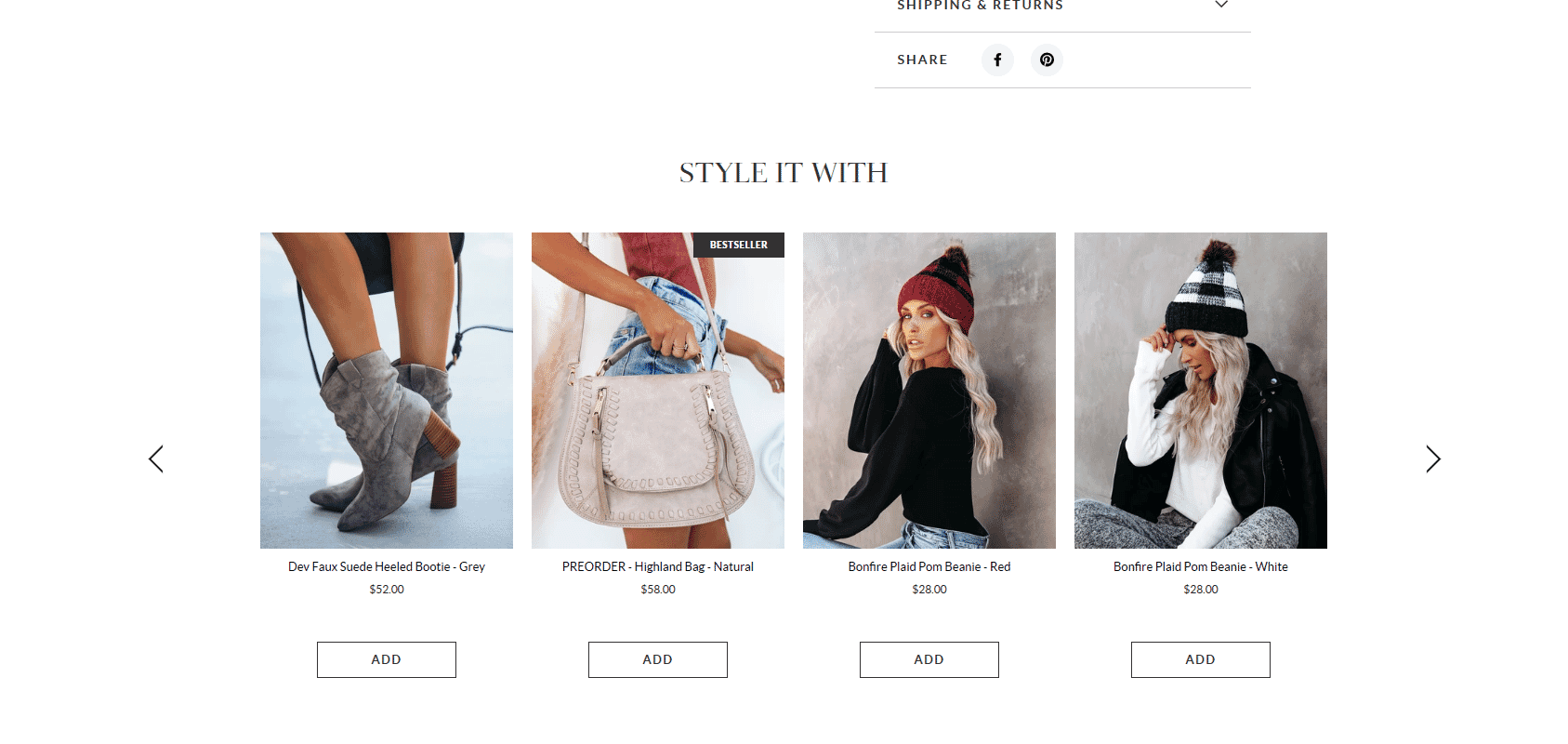
Vici nailed the cross-sells here.
‘Style it with’ sounds much more engaging in their case than the old and tried ‘customers who bought this also bought’. Don’t forget to A/B test this, sometimes the ‘old and boring’ works best.
Another great cross-selling tactic is to use the cart.
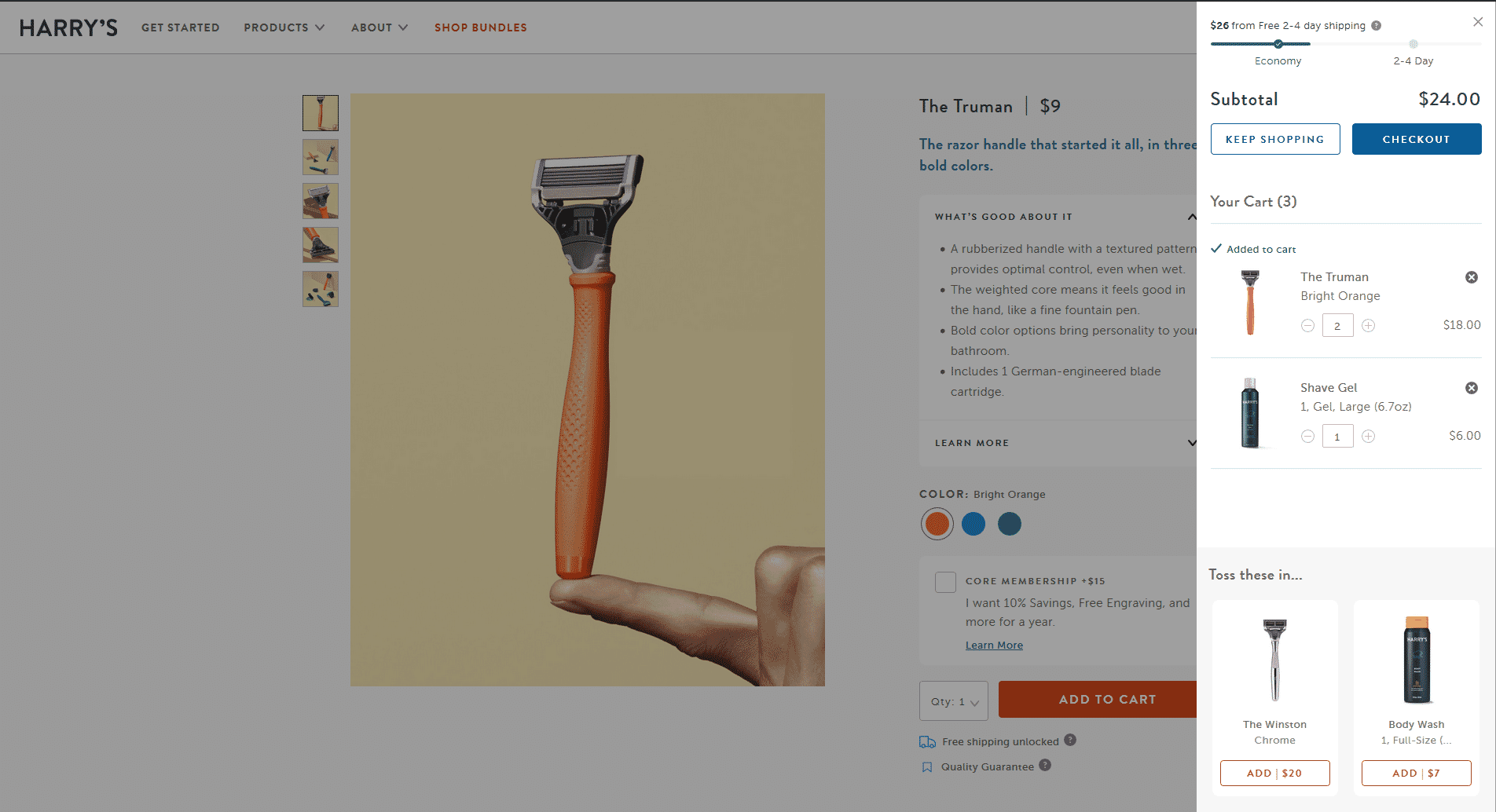
Harry’s is both upselling and cross-selling in the cart at the same time. I’m sure it works great for them.
There are several great Shopify apps that can help you increase sales with ups-sells and cross-sells: Reconvert and Honeycomb are the top-rated ones.
Further reading:
How to Upsell to Customers and Improve the Shopping Experience
Tip 6: Do SEO (Search Engine Optimization)
Shopify is SEO friendly out of the box, but it does have some shortcomings. Here are some working tips that can increase your traffic:
Avoid duplicate content
Duplicate content is content that appears on the Internet in more than on a single address (URL).
In Shopify, this happens quite often when your theme links to products in the collection scope. Shopify does use URL canonicalization, but since rel canonical is considered to be a ‘recommendation’, this approach sends mixed signals to Google and can make it hard for the search engine to determine which pages should be given priority. Thankfully, it’s an easy fix for your developer.
Write unique product descriptions
Unique and detailed product descriptions can make your website stand out both in the eyes of customers and search engines.
To write a great product description that will boost your sales as well as Google rankings, it has to:
- Help the buyer make the purchasing decision
- Answer the questions that product images or 360 spins can’t
- Highlight the benefits (features) of the product thoroughly
- Target the right SEO product keywords
To learn more about the intricacies of e-Commerce SEO, Bryan Dean has written a great E-commerce SEO guide that we can wholeheartedly recommend.
Optimize images for search
By properly optimizing Shopify images for SEO, you can get lots of quality traffic from Google Image Search. The team at Sirv has written a comprehensive guide on image optimization, check it out for a more in-depth list of techniques you can use.
Add structured data
Structured data is a special type of mark-up, which provides key information about your product.
Google and other search engines integrate structured data into their search results. It’s a crucial technique that can help you stand out from the competitors.
Consider adding these types of structured data to your Shopify store:
Here’s how your product search results will look after implementing structured markup in Google Image Search:
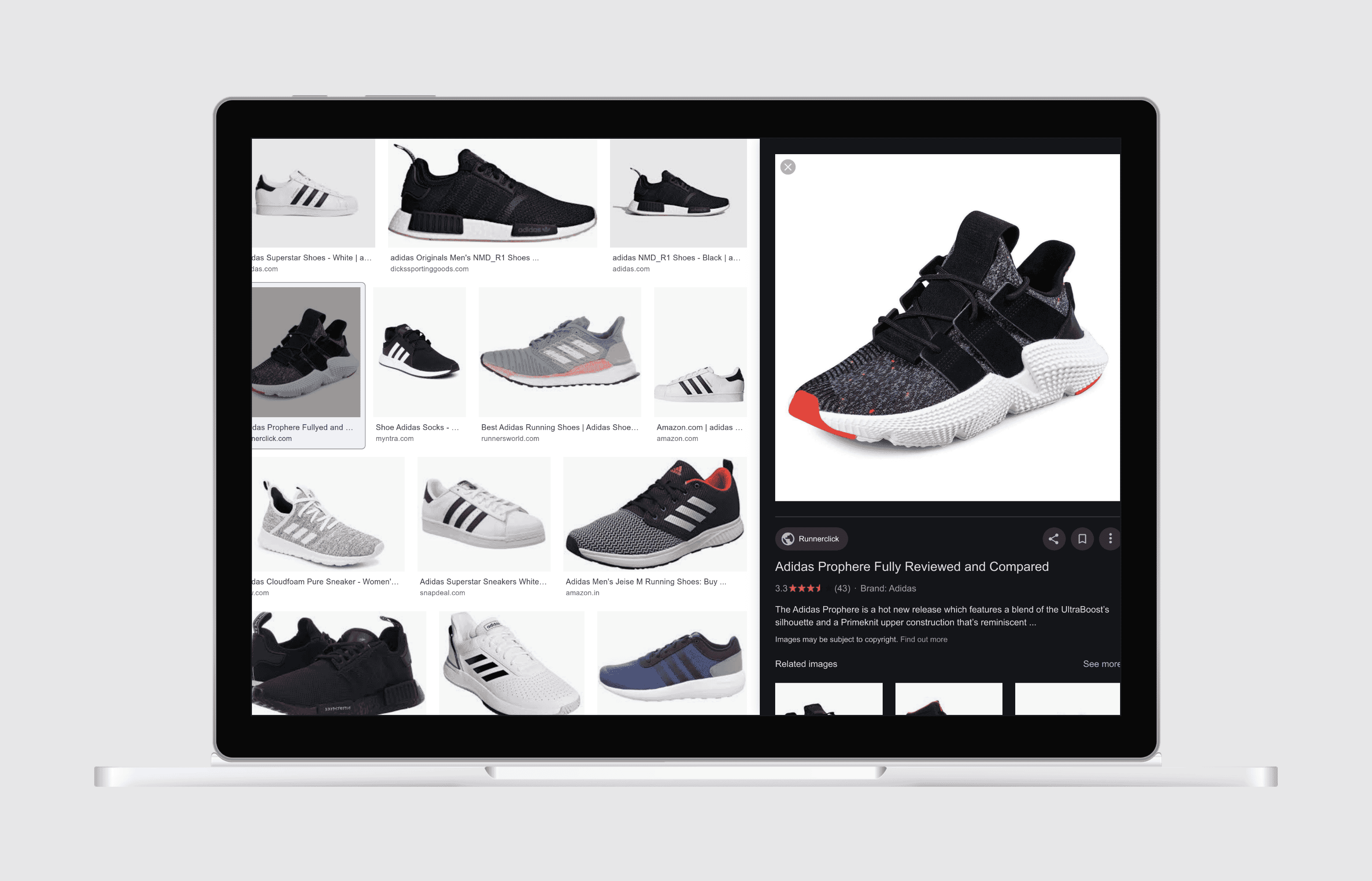
The image is very ‘shoppable’. No wonder Google Image Search is leading to lots of sales on Shopify stores.
For collection pages, you can use the CollectionPage structured data.
How to add structured data to Shopify?
This is best done by your developer to add it to your theme, and we wouldn’t recommend relying on apps for this.
Tip 7: Focus on Email Marketing
Email marketing is one of the best channels to connect with your customers and generate sales.
According to Barillance, e average email marketing ROI in e-commerce is 3,800% or $38 for every $1 invested.
Recommended Email Marketing Shopify apps:
Here are 8 Email campaigns every Shopify store should have:
Welcome Email
Welcome emails tend to have the highest open rate and helps to get the customer hooked with a discount.
Referral email
Feed two birds with one scone: let your customers promote your store to their friends.
Abandoned cart email
This email is important to remind customers that they forgot some stuff in their cart. Be creative and try to stand out.
Order confirmation email
Try to cross-sell or ask people to share their purchase on social media.
Upsell email
Encourage your customer to buy more. Personalized recommendations or curated emails can work very well.
Win-back email
The customer hasn’t stopped by your store for a while? Send them a reactivation email with an offer or a curated collection of products they might be interested in. Personalization really helps with this.
Survey email
Use incentives; people don’t like surveys unless you throw in a gift card or a nice discount.
Thank you email
Make this email fun and shareable.
If you’re looking for inspiration, check out really good emails.
Tip 8: Utilize Social Proof
Social proof is a psychological phenomenon where people assume the actions of others in an attempt to reflect correct behavior for a given situation. Humans view behavior as “more correct” if they see others doing it, too.
Here are a few ways you can use social proof to improve trust and authenticity in your products:
- User-uploaded product images
- Number of products sold
- Display expert reviews for your products’ endorsements
- Mark your best products as “Popular Choice”
- Tagging Products To Create Social Proof
- Display contextual details (such as location) to allow users to identify with the reviewer
- Add human pictures to your testimonials
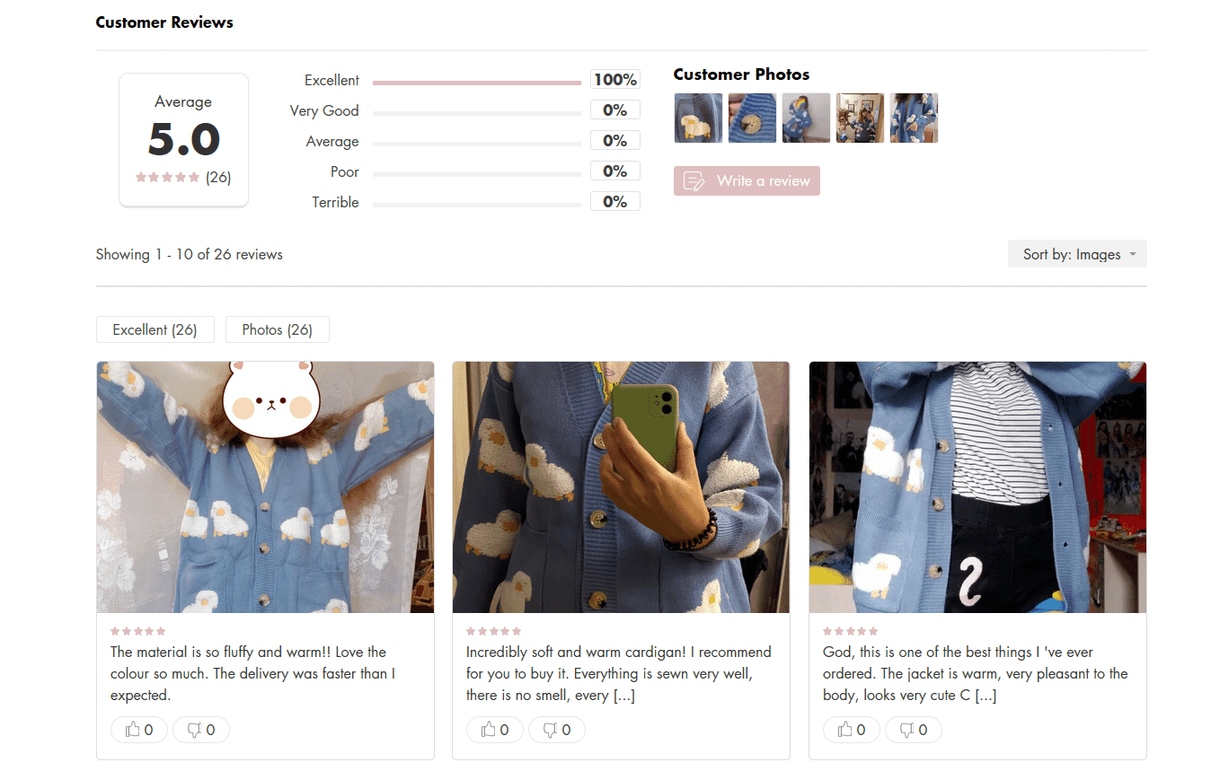
User-submitted photos of products look great on lianox.com
Recommended social proof apps:
If you’re looking for more ideas and examples, Shopify have covered social proof on their blog.
Tip 9: Reduce Friction at Checkout
The last thing you need is someone to abandon their cart because the checkout process was too confusing or tedious. Your goal is to make the check out process as intuitive and painless as possible. Don’t barricade the checkout with ads, coupons, additional offerings, or other distractions. And for repeat customers, consider express checkout options.
Don’t ask for unnecessary information
No one likes filling out forms. Only request the necessary information from your customers during the checkout process. For example, allow them to pre-fill the billing address from the shipping address. Or, use their postal code to pre-fill other areas of the form like city and state (for U.S. customers). Making the form as simple and quick as possible will lead to fewer cart abandonments.
Shopify allows you to configure some checkout fields:
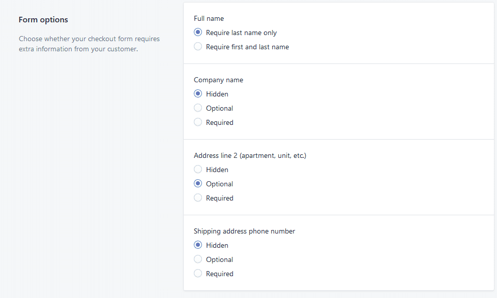
Change checkout copy to avoid common conversion pitfalls
Shopify has pretty well-optimized default values most of the time. Editing the text on your store’s checkout page can be something that really has a high impact on your conversion rate.
For example, the default express checkout text can make the process confusing for your customers, it’s not visible enough to indicate that people have more options (and not only the express ones). Shopify addresses this issue by adding a very small and barely noticeable ‘Or’ below the express checkout options:
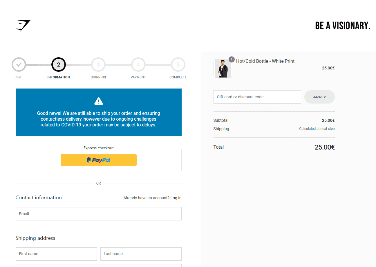
People can get confused and think that PayPal is the only checkout option here. Nice touch with the COVID-19 info though.
By editing your checkout page copy, you can address this and many other issues.
Out of the sandbox have written a great guide on changing your checkout page copy.
Express checkout
Allowing your users to quickly purchase your products without having to go through the hassle of filling out forms and/or creating accounts can have a profoundly positive effect on your conversion rate. Shopify has numerous express checkout options available.
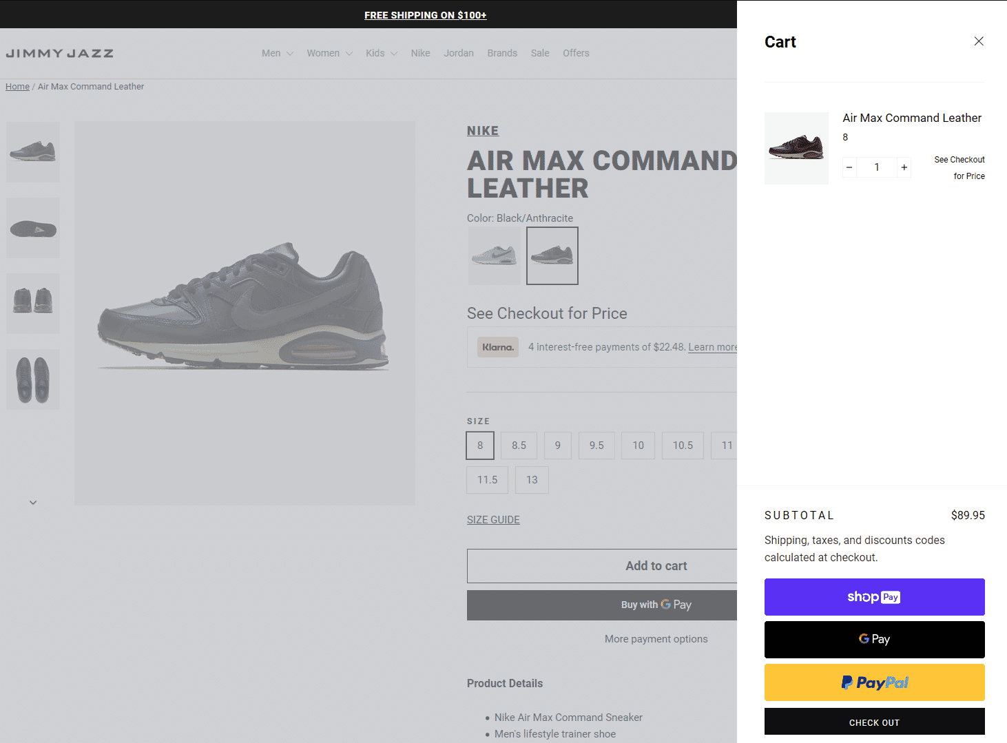
Express checkout in action.
While express checkout has clear benefits, the downsides are nothing to be scoffed at. You can’t upsell and it can be difficult for users to buy more than one product at a time. Keep this in mind and pay close attention to the average order value if you decide to test this feature. It’s not all about the conversion rate, you must look at the bigger picture.
Buy now, pay later services
Services like Klarna and Afterpay have become incredibly popular in the last couple of years. For example, Klarna handles a million transactions for 200,000 merchants daily [source].
‘Buy now, pay later’ can definitely increase conversions for high-ticket products. They’re very easy to use for the consumer and don’t add additional costs (unless the person using it delays the payment). They’ll charge you, the business owner a fee between 4% and 6%. We’d recommend running a test and comparing the profit, not the conversion rate alone.
James Parsons from Content Powered has an interesting take on whether these services will improve your bottom line in the long run.
Keep Your Customers Happy
It’s important to make a long-term investment in your customers. Keeping them happy is the ultimate goal, and that can be done by a) having a product that wows them, and b) providing a pleasant and seamless shopping experience. All of the tips above are provided to help you over-deliver on the customer experience, and, in turn, improve your e-commerce sales.
Snap36 and Sirv are here to help you along the way. Get in touch with us to learn how to get your product imagery online quickly and enable your website to showcase high-resolution, high-caliber, and interactive spinning imagery.


