Deep Dive into Image Personalization: Why It’s Great and How to Use It (Examples Inside)
Personalization has become one of the hottest marketing trends.
Nowadays, shoppers want not only products – they want better experiences. That’s what makes them come back for more.
But there’s one thing that hasn’t had enough attention in this wild personalization ride: Images!
Chat with our little friend below to learn how image personalization can help your business.
Try our bot
I’m here to Sirv you ?
Why personalize?
Personalization has a positive effect on customer relationships, engagement and conversion rate
Marketers who use personalization in their marketing strategy almost unanimously agree that it has a positive effect on advancing customer relationships.
In fact, according to an Evergage survey, 74% believe personalization has a strong or extreme impact. It has even more impact than email design.
Here’s a detailed breakdown:
What is the impact, if any, of personalization on advancing customer relationships?
The benefits are evident.
What are the main benefits you see from personalization for your organization?
And the results speak for themselves.
What percentage improvement or “lift” are you generally seeing from personalization efforts?
It’s clear that personalization is effective.
Let’s move on to the important part: how to use personalized images.
Image personalization in email
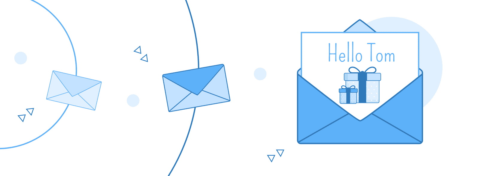
Email is the most widely used channel for personalized content. Let’s be honest, practically everybody uses some sort of merge tags in their email campaigns, so text personalization lost its WOW effect long ago.
With email open and click rates dropping dramatically in the last couple of years, image personalization has become a powerful tool for keeping email campaigns effective.
Here’s a couple of examples that’ve mastered it.
Discount email
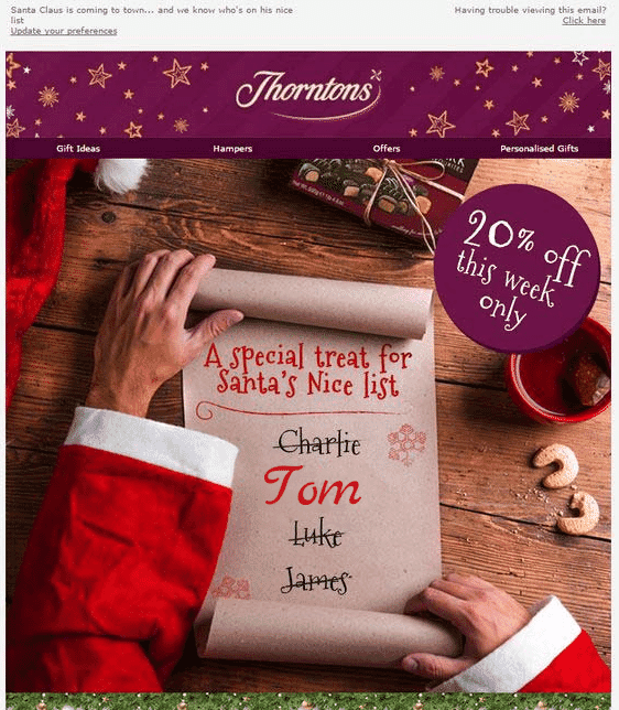
An example campaign from Thorntons
Santa’s nice list sounds like a pretty good place to be. It takes a little bit of image personalization to go from a dull discount email to something more meaningful and fun.
Promotional email
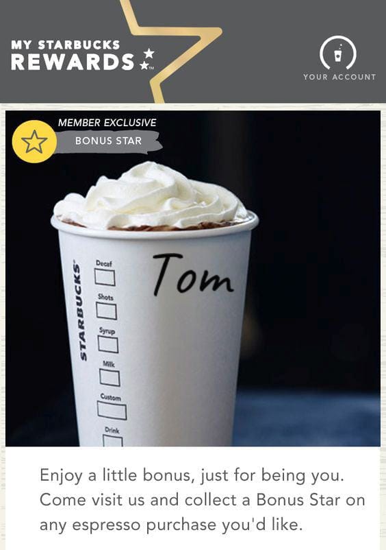
Yes, it’s a name on a Starbucks coffee. If you’ve talked to our bot – it’s your name on a Starbucks coffee, hehe.
This one kind of takes you back to your favorite Starbucks with that fresh cup of coffee with your name on it. Mmmm.
Cart abandonment
Stats don’t lie, almost 70% of all carts are abandoned. Sprinkle just a little bit of personalization into your abandoned cart emails and see what happens (hint: it’ll be great).
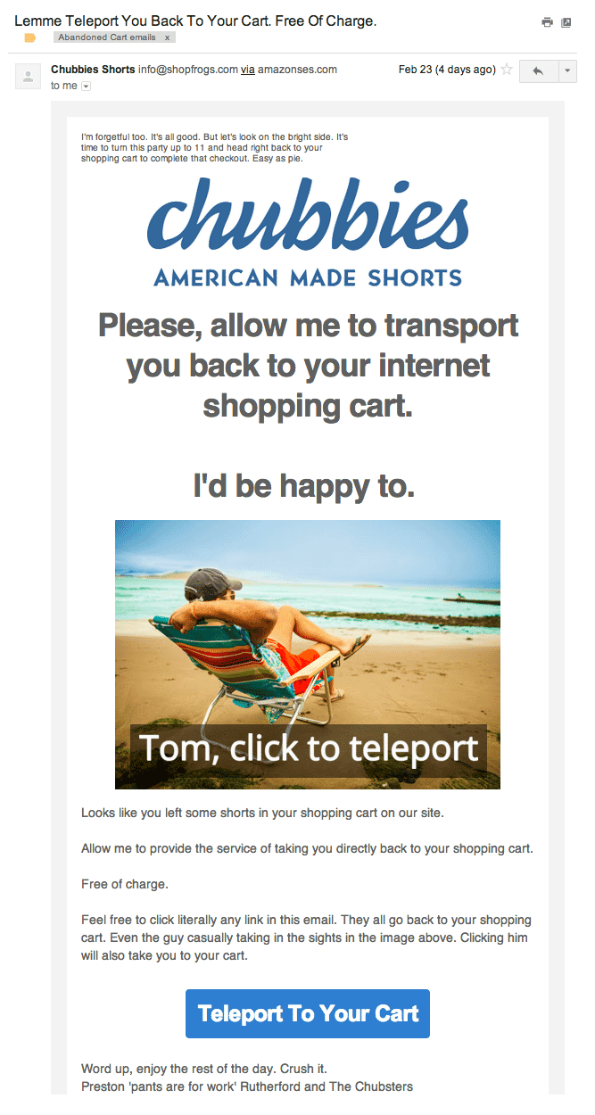
A cart abandonment campaign from Chubbies Shorts. We added image personalization ourselves though.
Great copy + a crisp personalized image = a perfect combination to recover an abandoned cart.
Cold email
Image personalization isn’t limited to a name.
FullStory used website screenshots of their leads with a “play” button overlay. It makes a lot of sense, since FullStory’s service is built entirely on recording visitor activity on your website.
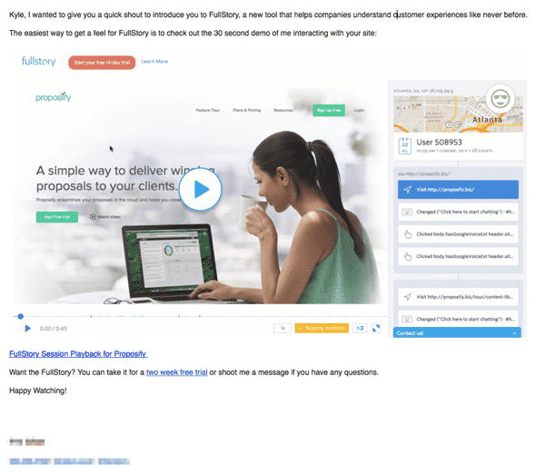
FullStory used website image screenshots of their potential customers in their email.
This email impressed Kyle Racki so much that he even created a blog post about it called The Best Cold Email I Ever Received.
PS: It’s not hard to automate this process.
Newsletter
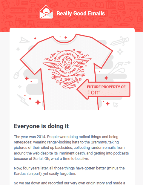
Really Good Emails newsletter
Those guys know what they’re doing. We highly recommend subscribing to Really Good Emails newsletter for great email marketing insights. They’ve been using image personalization for a long time, and it looks amazing.
Event email
Not only does Movember have a very noble cause, they’re taking it to another level with great copy and a snappy personalized image.
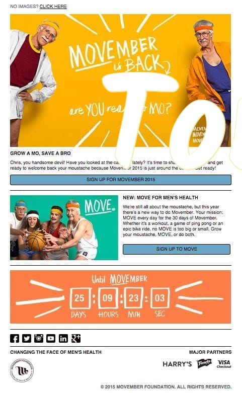
With a rebel yell she cried mo, mo, mo!
Good job, Movember people. There’s nothing Mo you can do to beat this.
Survey emails
It’s pretty hard to get people to take a survey without an incentive.
A nice personalized image might change the odds in your favor:

Wirecutter. Again, we added a little bit of personal touch to this with the name.
How to personalize email campaigns
Looks cool? Here’s how you can do it.
It’s quite simple since most marketing automation/email providers and personalization platforms support custom fields of some sort.
You’ll need two things:
- Image personalization software
- Data
For image personalization, you can use Sirv. It’s our blog, so no surprises here, right? 🙂
If you’ve played with our bot, you can see that all images on this page are personalized with your name.
Here’s how it works. Sirv generates images on-the-fly, based on the parameters you pass to the URL. It might sound complicated, but it’s not. Here’s an example, hover over the bold elements for explanation.
https://sirv.sirv.com/blog/Personalization/examples/Starbucks%202.jpg?text.0.text=[name, fallback=Tom]&text.0.position=center&text.0.size=30&text.0.color=060606&text.0.font.family=Caveat
Let’s break it down:
- https://sirv.sirv.com/blog/Personalization/examples/Starbucks%202.jpg – this is the image URL. Nothing special here.
- text.0.text – this parameter is responsible for the actual text. In our case, it’s [name, fallback=Tom]. You can have 4 separate text overlays active at a time.
- text.0.position – takes care of our text’s position. We have it set to “center”. You can position your text however you like, more in our docs.
- text.0.size – determines our text size in relative size to the image.
- text.0.color – sets the color of our text.
- text.0.font.family – used to set our font-family. It’s Caveat in this case. You can use Google fonts here.
The best part is that you don’t need to input these parameters into the URL by hand – Sirv has a powerful Image Customizer, where you can style your overlay text and other elements in a visual manner.
You’re not limited to text overlays, you can add image overlays and use your image metadata.
What data to use in personalization
For B2C you might want to collect:
- Name
- Location
- Purchase history
- Demographic data
- Behavioral data
- Weather conditions
If you’re short on data, you can always use data enrichment solutions to fill up this gap. Clearbit is one of the most popular services for this. It can help you make your forms shorter, further increasing your conversion rate.
For B2B, demographic and behavioral data aren’t as important.
“Firmographics” are a much better thing to focus on. Here’s what you can work with:
- Website
- Industry
- Annual revenue
- Company size
- Location
- Stage in the sale cycle
Again, you can use Clearbit to automatically gather firmographic data. Afterwards, you can quite easily customize your automation sequences and increase your conversions.
Advanced techniques
Most marketers segment their users based on demographics or location and email them in bulk. Some combine behavioral and demographic data with machine learning to achieve maximum levels of personalization.
A good example of this is Booking.com. You’ve probably experienced their marketing first-hand. It’s enough to visit a single page to instantly get retargeted with their ads all over the place, but that’s pretty basic dynamic remarketing.
If you sign up for Booking.com, here’s where they start bombarding you with emails based on your behavior and demographic data.
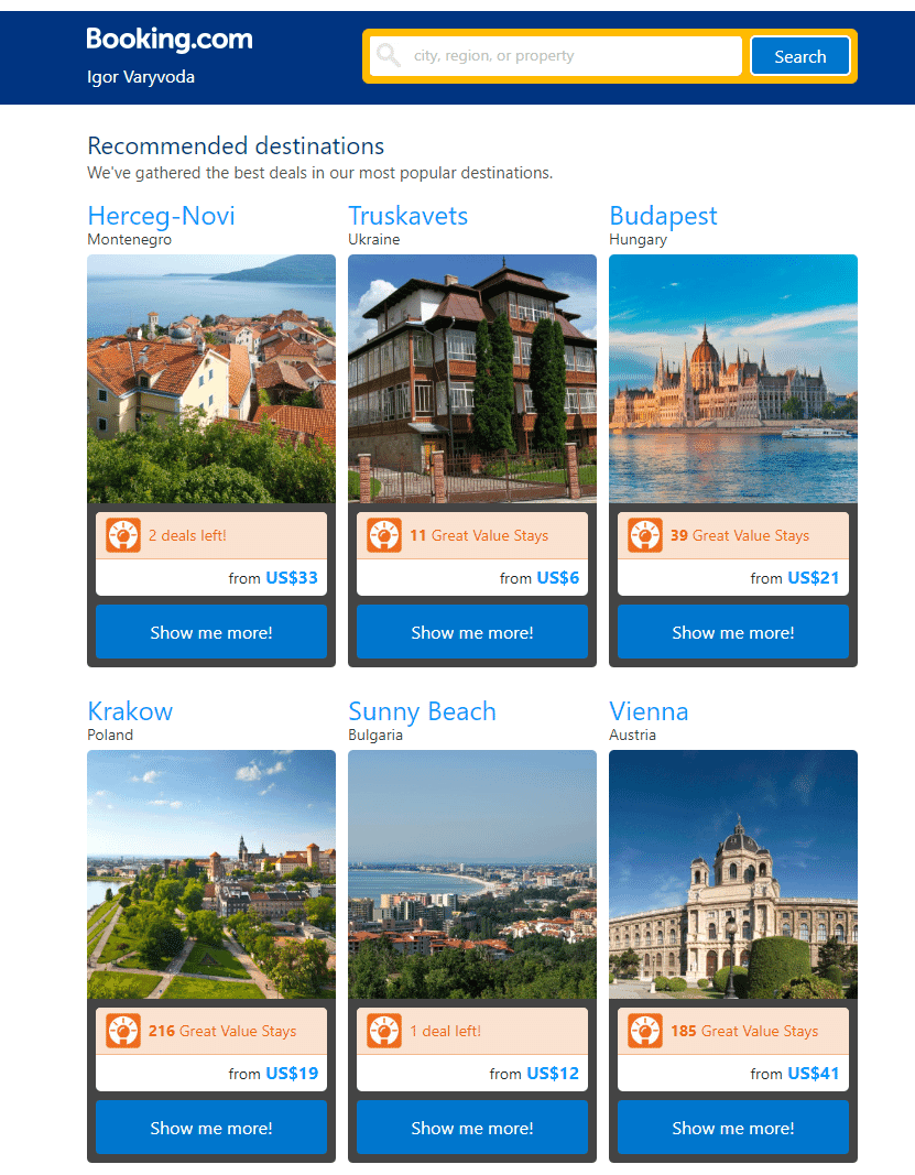
A tidy list of deals, tailored to my interests.
I did not express any interest in Sunny Beach or Krakow. But people similar to me did, so Booking.com’s algorithms think that I’m likely to be interested in these locations. (While they weren’t right in the Sunny Beach case, Krakow is definitely on my bucket list).
Technically, the email is great. It’s tidy and has deals.
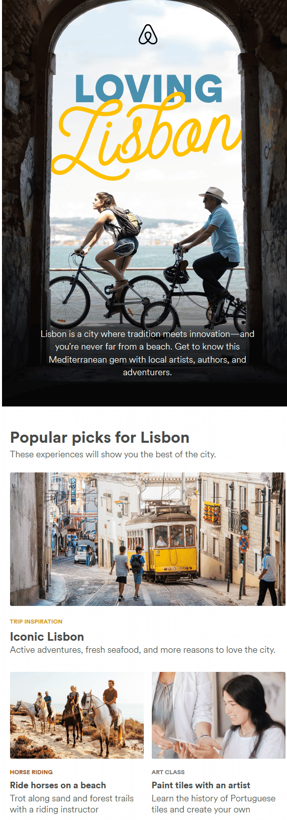
Compare it to AirBNB’s email below.
Crisp imagery, great typography and genuinely interesting content. In my eyes, this is a significant upgrade compared to Booking.com’s email.
Let’s move on to our second use-case – landing pages.
Personalized images on landing pages
Landing page personalization is one of my favorite techniques ever. Personalized landing pages improve conversions, which means more leads and more bang for the buck on your ad spend.
“On your first-ever visit to the site, we could show you something that would resonate with you. That was the holy grail and it actually worked. This is a huge competitive advantage for us.”
– John Ewing, BMI Research
There are several ways to personalize your landing pages:
- Personalization by context: use URL parameters to detect ad keywords, campaign sources or anything you can think of. Then change the landing page content accordingly.
- Personalization by live data: grab location, business name and other firmographics with external services and use this data to personalize the landing page.
Here are some interesting examples that were proven to increase conversions.
Referrer based personalization
One of the most common techniques is to use the Campaign Source to personalize your landing page content. This way you can show different copy or design elements to people coming from different campaigns.
Here’s what Obama did for people coming from Reddit.

If you ever visited ProductHunt or HackerNews, you’ll often see this tactic used.

Owox used a huge call-out for people who came from ProductHunt
It’s not really hard to pull off and can help you increase conversions dramatically.
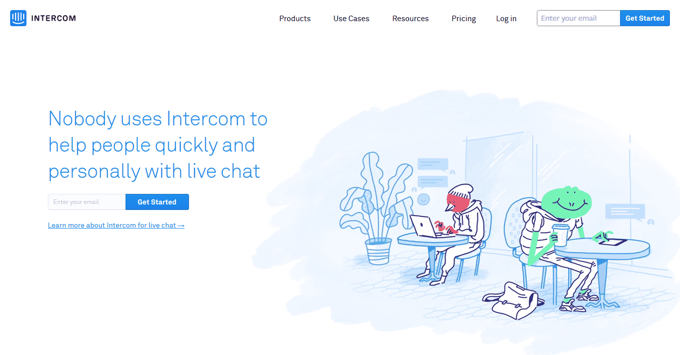
If you’ve ever noticed Intercom’s chat widget, you’ve probably seen that they include a “powered by Intercom” link. If you click it, you’ll see a page like this:

They grab the “company” parameter’s value and insert it into the page dynamically. They also show a stylish illustration and selected product features based on their second URL parameter – “solution”.
This tactic can be used for literally anything you can pass in the URL.
However, make sure you have full control over how your URLs are generated, to avoid unwanted results like this:
It’s totally fabricated. But you get the point.
Dynamic keyword insertion
Provided out-of-the box in AdWords Google and Bing ads, dynamic keyword insertion has proven itself to boost conversion rates and landing page quality scores. You’re basically dynamically changing your landing page elements based on search keywords.
Look how Intercom personalizes its landing pages based on ad content. A whopping 300% conversion rate increase was surely worth the work they put into this.

Be careful not to use Dynamic Keyword Insertion for broad match keywords, you may end up looking silly and ultimately hurting your conversion rate. It’s a safe bet to customize your landing pages based on Campaign and ad group.
Personalization by location
Customer’s location can be crucial for some businesses. It makes sense that people in Chile and in British Columbia are different.
Nationwide Insurance experimented with their landing page, serving a different version for people from cold regions.

Before

After
I’d argue that the “snowy” version is just better all around with its nicer contrast, a smiling girl and other subtle changes, regardless it performed much better in colder regions, where it was served. It’s easier for people to receive your message if they can relate to it visually.
Personalized banners
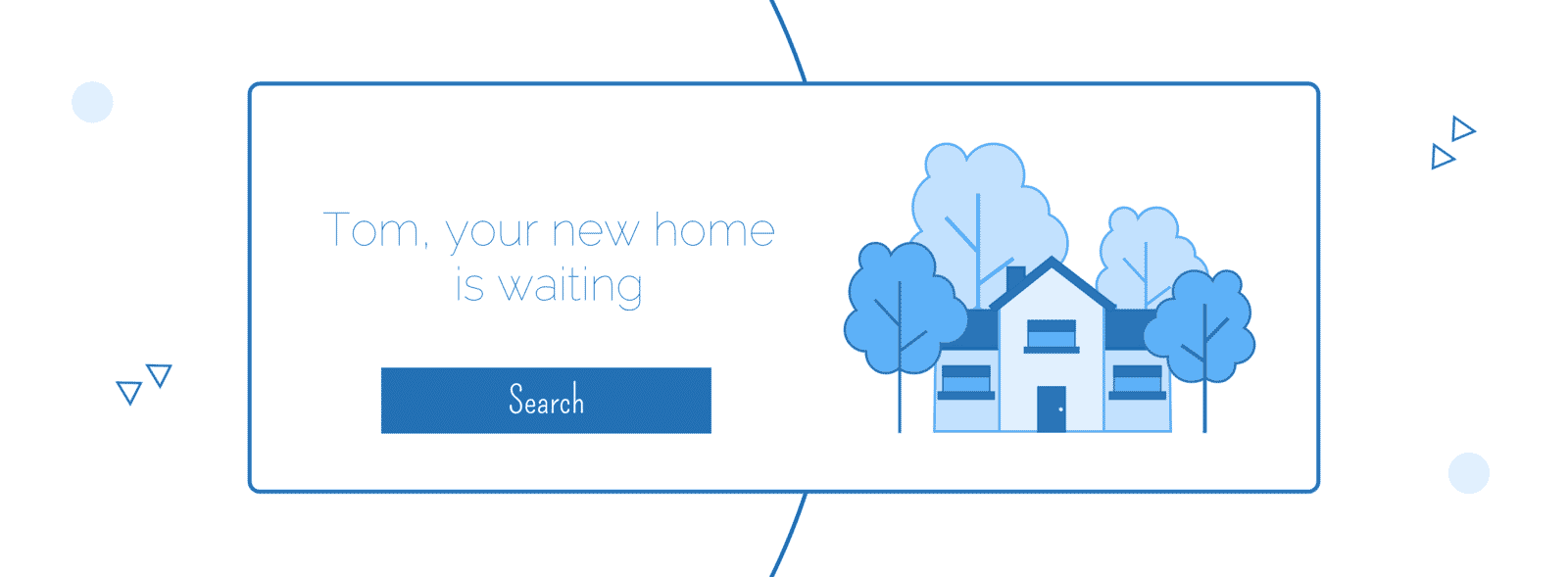
When it comes to the most commonly used personalization format, banners lead the way.
This is because email is the most widely used personalization channel.
It doesn’t mean that banners are limited to email only. You can use them on landing pages, pop-ups and chat bots.
We’ve created some examples using Sirv to show you what’s possible.
Simple banner with an overlay
Using someone’s name together with a call-to-action can yield a 42% higher view-to-submission rate compared to generic CTAs:

Personalized GIF “slideshows”
Sirv can create animated personalized banners. Just upload a set of images and you can create an animated GIF in mere seconds.
Offer a discount, with images and a unique message tailored to each customer:
360-degree product spins
Automatically change the product/name/price to encourage customers to purchase particular products:
Displaying your 360-degree product images as personalized GIFs seems like no small task.
Custom product personalization
Give your customers an instant preview of how their customized product could look. It’s easy to build product customization tools for your online store:


Start personalizing your images
How do you create personalized images with Sirv?
Use your merge tags or custom fields in our 80+ dynamic imaging options at the end of your image URL, or use our new image customizer – no need to add options by hand. Click any image in your account, then adjust the options on the right:
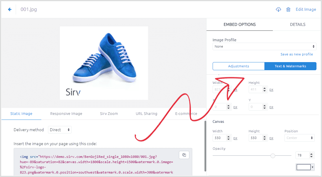
Create your Sirv account today and harness the true power of image personalization.
Got any questions? Our expert support team will happily provide any help you need.

